
How UX shapes successful web design in 2026
March 11, 2026
Top 7 doitd.com Alternatives 2026
March 13, 2026
Your business cannot afford a website that frustrates mobile visitors. With mobile devices driving 55% of global traffic, poor mobile usability directly translates to lost customers and revenue. This guide provides clear, actionable steps for small and medium businesses to build responsive websites that enhance user experience, improve SEO rankings, and support sustainable growth in 2026.
Table of Contents
- Why Responsive Design Matters In 2026
- Preparing To Build A Responsive Website: Tools And Requirements
- Step By Step Guide To Building A Responsive Website
- Common Challenges And How To Avoid Them
- Expected Benefits And Measuring Success
- How Done Can Help You Build Your Responsive Website
- Frequently Asked Questions
Key takeaways
| Point | Details |
|---|---|
| Mobile dominance | Mobile devices account for over half of global web traffic, making mobile usability essential for business success. |
| SEO advantage | Responsive design improves search rankings by aligning with Google’s mobile first indexing requirements. |
| Cost efficiency | A single responsive site reduces maintenance costs and complexity compared to separate mobile versions. |
| Business growth | Following responsive design best practices enhances user experience and drives measurable business outcomes. |
Why responsive design matters in 2026
The digital landscape has shifted dramatically. Mobile devices now account for approximately 55% of global website traffic, fundamentally changing how businesses must approach web design. If your site fails on mobile, you lose more than half your potential audience before they read a single word.
Google prioritises mobile friendly websites in its search rankings, treating your mobile version as the primary site for indexing purposes. This mobile first indexing approach means your mobile experience directly impacts your visibility in search results. Sites that ignore mobile optimisation face significantly reduced organic traffic and lost business opportunities.
Responsive web design is crucial for strong SEO due to Google’s mobile first indexing, ensuring your site adapts seamlessly across all devices without creating duplicate content issues. This unified approach simplifies your technical SEO whilst delivering consistent branding and messaging to users regardless of how they access your site.
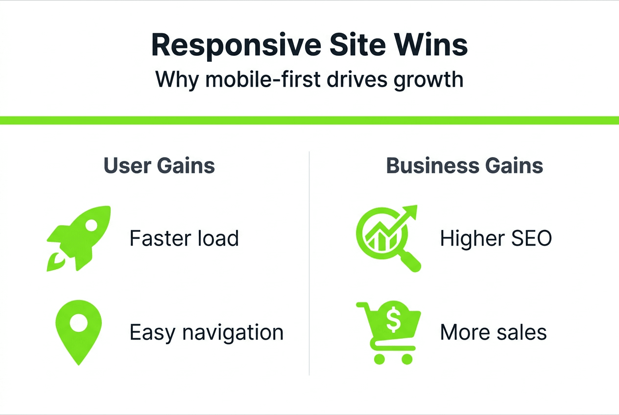
The responsive web design benefits extend beyond search rankings. Users expect fast, intuitive experiences that work perfectly on their chosen devices. When your site delivers this experience, you build trust and credibility that translates to higher engagement, longer session durations, and improved conversion rates.
“Responsive design has evolved from a nice to have feature to an absolute necessity. The diversity of devices and heightened user expectations mean businesses cannot succeed with rigid, desktop only approaches.”
Key benefits include:
- Unified user experience across smartphones, tablets, and desktops
- Simplified content management with one site instead of multiple versions
- Improved page speed and performance when properly implemented
- Higher conversion rates through optimised mobile user journeys
- Better analytics and tracking with consolidated data sources
Understanding responsive design challenges 2026 helps you approach implementation strategically, avoiding common pitfalls whilst maximising the competitive advantages responsive design provides in today’s mobile dominated marketplace.
Preparing to build a responsive website: tools and requirements
Successful responsive design starts with proper preparation. Before writing a single line of code, you need the right tools, fundamental knowledge, and clear strategic direction for your project.
HTML is fundamentally responsive or fluid, with browsers naturally reflowing content based on viewport size. Understanding this principle helps you work with the web’s inherent flexibility rather than fighting against it. Your foundation begins with semantic HTML that structures content logically, making it adaptable across contexts.
Essential tools include:
- Modern code editor with syntax highlighting and error detection
- Multiple browsers for testing (Chrome, Firefox, Safari, Edge)
- Browser developer tools for inspecting responsive behaviour
- CSS framework such as Bootstrap or Foundation for rapid prototyping
- Version control system like Git for tracking changes
- Local development environment for safe testing
Your content management system choice significantly impacts long term maintenance. Select a flexible CMS that supports responsive templates, allows easy content updates across device contexts, and provides mobile preview capabilities. Popular options include WordPress, Drupal, and headless CMS solutions that separate content from presentation.
Pro Tip: Start by auditing your existing content and identifying which elements need prioritisation on mobile devices. Mobile users often have different goals than desktop visitors, so your responsive strategy should reflect these behavioural differences.
| Preparation aspect | Key considerations |
|---|---|
| Technical skills | Basic HTML, CSS, and understanding of media queries |
| Design approach | Mobile first thinking and flexible grid systems |
| Content strategy | Prioritised information hierarchy for small screens |
| Testing capacity | Access to real devices or reliable emulation tools |
| Performance budget | Target load times and file size limits per viewport |
Investing time in web development basics pays dividends throughout your project. Understanding responsive design purpose helps you make informed decisions about layout, navigation, and interaction patterns that serve users across all contexts.
Plan your content layout by sketching wireframes for key breakpoints. Consider how elements reorder, resize, or hide as screens shrink. This planning phase prevents costly redesigns later when you discover navigation or content doesn’t work on actual mobile devices.
Step by step guide to building a responsive website
Building a responsive website follows a logical progression that ensures quality results. This methodical approach prevents common mistakes whilst creating sites that truly serve users across all devices.
-
Adopt a mobile first design philosophy. Design for small screens initially, then progressively enhance for larger viewports. This approach forces you to prioritise essential content and functionality, ensuring mobile users receive a complete, valuable experience rather than a stripped down desktop version.
-
Create a flexible grid system. Use relative units like percentages or viewport units instead of fixed pixels. Your grid should fluidly adapt container widths whilst maintaining proportional relationships between elements. Modern CSS Grid and Flexbox provide powerful tools for responsive layouts without requiring heavy frameworks.
-
Implement CSS media queries strategically. Define breakpoints based on your content’s natural breaking points rather than specific device dimensions. Common breakpoints include 480px for phones, 768px for tablets, and 1024px for desktops, but let your design dictate these values.
-
Optimise all media assets. Serve appropriately sized images using responsive image techniques like srcset attributes or picture elements. Compress files without sacrificing quality, and consider lazy loading for images below the fold. Video should use adaptive streaming when possible.
-
Test rigorously across real devices and browsers. Simulators help during development, but nothing replaces testing on actual hardware. Borrow devices from colleagues or use device labs to verify your site performs well across the ecosystem your users actually use.
-
Maintain a single, unified codebase. Creating a single responsive site reduces maintenance compared to managing separate desktop and mobile versions. This consolidation simplifies updates, reduces errors, and ensures consistency across all user experiences.
“The beauty of responsive design lies in its efficiency. One codebase, one content strategy, one URL structure serving infinite viewport variations through intelligent adaptation.”
Navigation deserves special attention in responsive builds. Complex mega menus must transform into touch friendly mobile patterns without losing functionality. Consider hamburger menus, priority plus patterns, or tab bars that surface key navigation whilst hiding secondary options.

Form inputs require particular care on mobile devices. Ensure touch targets meet minimum size requirements (44×44 pixels minimum), use appropriate input types to trigger helpful mobile keyboards, and minimise required fields to reduce friction on small screens.
Pro Tip: Set a viewport meta tag in your HTML head to ensure proper scaling on mobile devices. Without this crucial tag, mobile browsers assume your site isn’t mobile optimised and render it at desktop width, forcing users to pinch and zoom.
Understanding why responsive design matters helps you make smart compromises when design and technical constraints conflict. Every decision should prioritise user experience whilst maintaining performance and accessibility standards.
Common challenges and how to avoid them
Even experienced developers encounter obstacles when building responsive sites. Anticipating these challenges helps you implement solutions proactively rather than troubleshooting problems after launch.
Fixed width elements break responsive layouts instantly. Resist the temptation to set absolute pixel widths on containers, images, or other components. Instead, use max width properties that allow elements to shrink naturally on smaller screens whilst maintaining reasonable sizes on larger displays.
Performance problems plague many responsive sites that simply hide content with CSS rather than truly optimising for mobile. Large desktop images still download on phones even when hidden, wasting bandwidth and slowing load times. Implement true responsive images and conditional loading to serve appropriately sized assets.
Responsive design has evolved to a non negotiable due to device diversity and user expectations. Testing only on your favourite device creates dangerous blind spots. The fragmented device ecosystem means you must verify functionality across multiple screen sizes, operating systems, and browser versions.
Common pitfalls to avoid:
- Neglecting touch interaction patterns in favour of hover dependent interfaces
- Using small, difficult to tap buttons that frustrate mobile users
- Implementing complex navigation that confuses rather than guides
- Forgetting to test forms thoroughly on actual mobile devices
- Overloading pages with large files that destroy mobile performance
- Ignoring landscape orientation and assuming portrait only usage
- Failing to optimise third party scripts that block rendering
Accessibility often suffers in responsive implementations when developers focus solely on visual adaptation. Ensure your responsive site maintains proper heading hierarchy, provides sufficient colour contrast, and works seamlessly with screen readers across all viewport sizes.
Text readability requires careful attention across breakpoints. Body text should remain comfortably readable without zooming, typically 16px minimum. Line lengths should adjust to prevent uncomfortably long lines on wide screens or cramped text on mobiles.
Content prioritisation mistakes occur when designers simply stack desktop layouts vertically for mobile. Thoughtfully reorder content to serve mobile user intent, potentially surfacing different information first or restructuring sections to match mobile browsing patterns.
Following website navigability tips ensures your responsive implementation enhances rather than hinders user journeys. Clear navigation, logical information architecture, and intuitive interaction patterns matter even more on constrained mobile screens.
Expected benefits and measuring success
Investing in responsive design delivers measurable business outcomes beyond improved aesthetics. Understanding these benefits helps you justify the investment and track return over time.
Improved user experience manifests in concrete metrics. Users spend longer on sites that work well on their devices, explore more pages, and return more frequently. This engagement signals quality to search engines whilst increasing opportunities for conversion.
Mobile friendliness is a key ranking signal, directly impacting your SEO performance. Sites that deliver excellent mobile experiences see improved visibility in search results, driving more organic traffic without additional advertising spend. This competitive advantage compounds over time as search engines increasingly prioritise mobile optimised content.
Revenue impact can be dramatic. Renault achieved 300% revenue growth and 200% order volume increases after platform upgrades that included responsive implementation. Whilst results vary, most businesses see measurable conversion rate improvements when mobile users enjoy frictionless experiences.
| Metric | What to measure | Success indicators |
|---|---|---|
| Traffic | Mobile vs desktop visits | Increasing mobile traffic percentage |
| Engagement | Pages per session, time on site | Higher engagement across devices |
| Conversion | Form completions, purchases | Improved mobile conversion rates |
| Performance | Page load times | Sub 3 second load times on mobile |
| SEO | Organic traffic, rankings | Improved positions for target keywords |
Key benefits include:
- Reduced bounce rates as users find sites easier to navigate
- Higher average order values when mobile checkout flows smoothly
- Increased brand credibility through professional, modern presentation
- Lower maintenance costs from managing one site instead of multiple versions
- Better data quality from unified analytics across all devices
Track your responsive site’s impact through analytics platforms that segment performance by device type. Monitor mobile specific metrics like tap areas clicked, scroll depth, and interaction patterns that reveal how users actually engage with your responsive implementation.
Conversion rate differences between desktop and mobile visitors highlight optimisation opportunities. Significant gaps suggest mobile experience issues requiring attention, whilst converging rates indicate successful responsive implementation.
Understanding business growth through web design connects technical implementation to strategic outcomes. Your responsive website becomes a growth engine when it removes friction, builds trust, and guides users smoothly toward valuable actions regardless of their device.
How Done can help you build your responsive website
Building a responsive website requires expertise across design, development, and digital strategy. Done specialises in creating web development solutions tailored for businesses seeking growth through enhanced online presence.

Our team brings proven experience developing responsive sites that drive measurable results for SMEs across Luxembourg and Europe. We handle every aspect from initial strategy and design through development, testing, and ongoing optimisation, ensuring your site performs excellently across all devices.
Understanding why invest in web development helps frame responsive design as strategic business investment rather than technical expense. The custom web development benefits we deliver include responsive implementations aligned with your specific business goals, target audience needs, and growth objectives. Let’s discuss how a professionally built responsive website can transform your digital presence and business outcomes.
Frequently asked questions
What is responsive web design?
Responsive web design creates websites that automatically adapt layout, images, and functionality to work optimally across all devices and screen sizes. This approach uses flexible grids, fluid images, and CSS media queries to deliver appropriate experiences whether users visit on phones, tablets, or desktops, ensuring consistent quality without requiring separate mobile sites.
How long does it take to build a responsive website?
Timelines vary based on complexity, but most business websites require 8 to 16 weeks from planning through launch. Simple sites with standard features may complete faster, whilst complex e commerce or custom functionality extends development time. Proper planning and clear requirements help projects stay on schedule.
Do responsive websites cost more than standard sites?
Initial development may cost slightly more, but responsive sites significantly reduce long term expenses by eliminating the need for separate mobile versions. You maintain one codebase, update content once, and avoid the complexity of managing multiple sites, making responsive design more cost effective over time.
Will my existing website work on mobile devices?
Many older sites function poorly on mobile, displaying tiny text, requiring horizontal scrolling, or featuring broken layouts. Testing your current site on various devices reveals whether responsive redesign is necessary. Understanding responsive design purpose helps evaluate whether your existing site meets modern standards.
How do I test if my website is truly responsive?
Use browser developer tools to simulate various screen sizes, test on multiple real devices, and employ online tools that capture screenshots across device types. Monitor analytics for mobile usability issues like high bounce rates or low conversion rates that indicate problems requiring attention.


