
Tips for Boosting Newsletter Sign-Ups: Virtual and Physical Strategies
March 11, 2025
What Is Web Development and Why It Matters
February 15, 2026
Struggling to keep customers engaged when they switch from a smartphone to a desktop? For digital marketing managers in Luxembourg, seamless shopping experiences across devices are now a competitive standard. By mastering responsive web design, your e-commerce site can adapt fluidly to every screen size, delivering consistent, user-friendly journeys. Discover how these principles can help increase engagement and drive more conversions, while optimizing for better performance and search rankings.
Table of Contents
- Defining Responsive Web Design Principles
- Key Elements of Mobile-First Design
- How Responsive Sites Drive User Engagement
- Impact on SEO and Conversion Rates
- Avoiding Common Responsive Design Mistakes
Key Takeaways
| Point | Details |
|---|---|
| Responsive Web Design | Adopts flexible layouts and media to ensure consistent user experiences across all devices. |
| Mobile-First Approach | Prioritizes mobile usability from the outset, enhancing functionality for larger screens later. |
| Performance Optimization | Essential for maintaining fast load times and reducing bounce rates across various devices. |
| Common Mistakes | Avoid fixed layouts and complex navigation to improve overall user engagement and conversion rates. |
Defining Responsive Web Design Principles
Responsive web design (RWD) represents a strategic approach to creating websites that dynamically adapt to different screen sizes, resolutions, and device types. At its core, RWD ensures that digital experiences remain consistent and user-friendly across smartphones, tablets, desktops, and emerging device categories. Responsive design principles fundamentally transform how websites render content by utilizing flexible technologies.
The key technical foundations of responsive web design include:
- Flexible Grid Layouts: Proportional sizing that scales content smoothly
- Adaptive Images: Media that resize without losing quality or aspect ratio
- CSS Media Queries: Dynamic style adjustments based on device characteristics
- Fluid Typography: Text that scales appropriately across different screen dimensions
- Touch-Friendly Navigation: Interactive elements designed for multiple input methods
Implementing responsive design requires careful consideration of technical constraints. Performance optimization becomes critical, as designers must balance visual richness with loading speed across varied network conditions. Bandwidth limitations and device processing power directly impact user experience, making efficient code and strategic design paramount.
Performance Considerations for responsive websites include minimizing resource-heavy elements, leveraging browser caching, and implementing progressive loading techniques. Designers must craft experiences that feel seamless and instantaneous, regardless of the user’s device capabilities.
Pro tip: Test your responsive design across multiple devices and network speeds to ensure consistent performance and user experience.
Key Elements of Mobile-First Design
Mobile-first design is a strategic approach that fundamentally transforms how websites are conceptualized and developed, prioritizing mobile user experiences from the initial design phase. Mobile design core principles emphasize creating digital experiences that begin with the smallest screen and progressively enhance functionality for larger devices.
The critical elements of mobile-first design include:
- Content Prioritization: Focusing on essential information and reducing visual clutter
- Performance Optimization: Ensuring rapid loading times on mobile networks
- Touch-Friendly Interface: Designing larger touch targets and intuitive navigation
- Responsive Typography: Implementing scalable fonts that remain readable across devices
- Minimal Interface Design: Creating clean, unobstructed visual layouts
Successful mobile-first strategies require designers to rethink traditional web design paradigms. Instead of scaling down desktop experiences, developers must build upward, ensuring that core content and functionality work seamlessly on smaller screens. This approach demands careful consideration of user interaction patterns, screen real estate limitations, and diverse device capabilities.
User Experience Considerations play a crucial role in mobile-first design. Designers must anticipate how users interact with touchscreens, manage limited bandwidth, and navigate complex interfaces using smaller displays. Implementing responsive navigation, optimizing image sizes, and creating adaptive layouts become fundamental to delivering a superior mobile experience.
Pro tip: Regularly test your mobile design on multiple devices and network conditions to ensure consistent performance and user satisfaction.
Here’s a concise comparison of responsive web design and mobile-first design approaches:
| Approach | Primary Focus | Typical Starting Device | Key Business Advantage |
|---|---|---|---|
| Responsive Design | Adapting to all devices | Desktop or large screens | Consistent cross-device experience |
| Mobile-First Design | Optimizing for mobile users | Small screens and smartphones | Improved performance for mobile users |
How Responsive Sites Drive User Engagement
Responsive web design fundamentally transforms user interaction by creating seamless digital experiences across multiple devices. User engagement strategies demonstrate that adaptive design can significantly improve how users perceive and interact with digital platforms, reducing friction and enhancing overall satisfaction.
Key mechanisms through which responsive design drives user engagement include:
- Consistent User Experience: Maintaining uniform design and functionality across devices
- Reduced Friction: Eliminating navigation challenges and visual inconsistencies
- Faster Load Times: Optimizing content delivery for different screen sizes and network conditions
- Improved Accessibility: Creating interfaces that work intuitively for diverse user needs
- Enhanced Credibility: Presenting a professional, well-designed digital presence
E-commerce platforms particularly benefit from responsive design by creating intuitive shopping experiences. When users can seamlessly browse, compare, and purchase products across smartphones, tablets, and desktops, they are more likely to complete transactions and return to the site. This continuity breaks down traditional barriers between device experiences, allowing customers to start shopping on one device and complete their purchase on another without disruption.
Psychological Impact plays a crucial role in user engagement. Responsive sites that adapt smoothly to user devices create a sense of reliability and professionalism. When users encounter a website that looks and functions perfectly regardless of their screen size, they develop increased trust and are more likely to spend time exploring content and making purchasing decisions.
Pro tip: Conduct regular cross-device user testing to identify and eliminate any potential friction points in your responsive design.
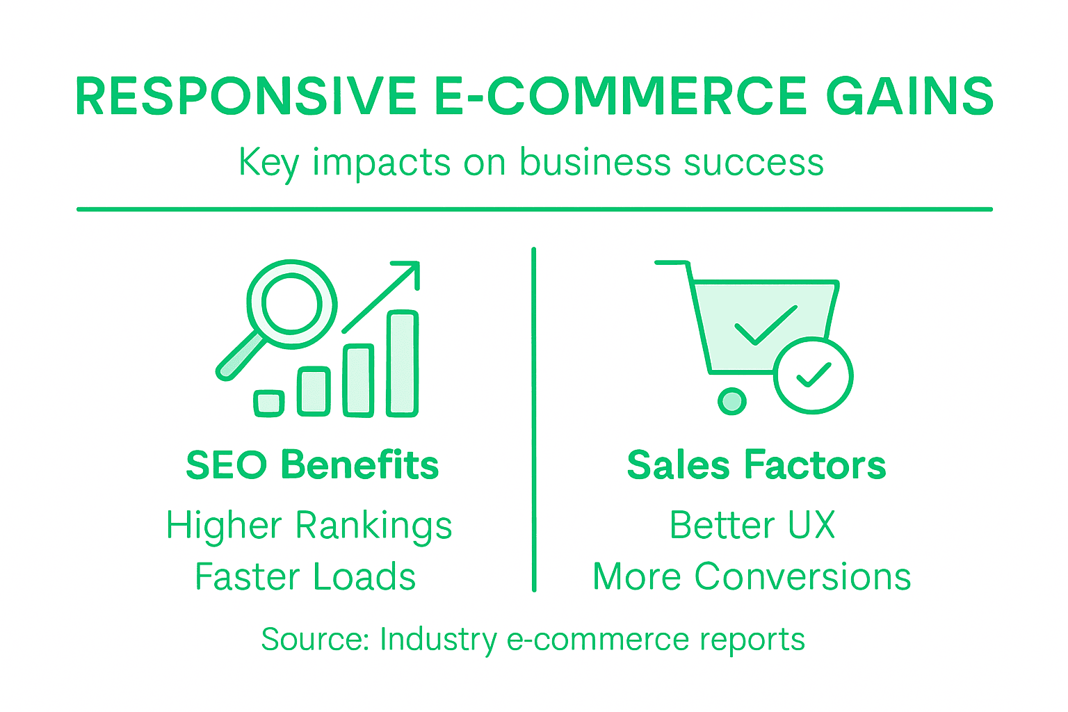
Impact on SEO and Conversion Rates
Responsive web design is not just a visual strategy but a critical component of digital marketing success. Mobile-first indexing strategies demonstrate how websites can significantly improve search engine rankings and user engagement by creating seamless, device-agnostic experiences.
Key SEO and conversion rate impacts include:
- Enhanced Search Rankings: Google prioritizes mobile-friendly websites
- Lower Bounce Rates: Consistent user experience across devices
- Improved User Engagement: Faster loading times and intuitive navigation
- Simplified Site Management: Single responsive design instead of multiple versions
- Increased Organic Traffic: Better indexing and user accessibility
Conversion optimization is directly tied to responsive design’s ability to create frictionless user experiences. When potential customers can easily navigate, read content, and complete transactions regardless of their device, they are more likely to convert. This seamless interaction builds trust and reduces the technical barriers that traditionally prevent online purchases.
Performance Metrics reveal the tangible benefits of responsive design. Websites that adapt smoothly across devices typically see higher engagement rates, longer session durations, and more completed transactions. By eliminating the frustrations associated with poor mobile experiences, businesses can create a more inviting digital environment that encourages user interaction and drives revenue.
Pro tip: Regularly audit your website’s mobile performance using Google’s PageSpeed Insights to identify and resolve responsive design optimization opportunities.
Avoiding Common Responsive Design Mistakes
Responsive web design requires strategic planning and meticulous execution to create truly adaptable digital experiences. Common design pitfalls can significantly undermine a website’s effectiveness and user engagement across different devices.
Critical mistakes to avoid include:
- Fixed-Width Layouts: Restricting content adaptability
- Neglecting Mobile-First Approach: Designing for desktop first
- Inconsistent Typography: Poor font scaling across devices
- Overcomplicated Navigation: Complex menus that break on smaller screens
- Performance Optimization Failures: Heavy assets that slow mobile loading
Designers must recognize that responsive design goes beyond mere visual scaling. It demands a holistic approach that considers user interaction, performance, and accessibility across diverse device ecosystems. This means carefully crafting flexible layouts, optimizing images and media, and ensuring that interactive elements remain functional and intuitive regardless of screen size or input method.

Technical Considerations play a crucial role in avoiding responsive design failures. Proper implementation of CSS media queries, flexible grid systems, and responsive image techniques are essential. Designers should prioritize performance metrics, minimize resource-heavy elements, and conduct extensive cross-device testing to identify and resolve potential usability issues before launch.
Pro tip: Use browser developer tools and online responsive design testing platforms to simulate and validate your website’s performance across multiple device types and screen sizes.
Below is a summary of common responsive design mistakes and their potential impacts:
| Mistake | User Experience Impact | Business Consequence |
|---|---|---|
| Fixed-width layouts | Poor adaptability, hard to read | Increased bounce rates |
| Overcomplicated navigation | Confusing for users | Lower conversion rates |
| Neglecting performance optimization | Slow page loading | Reduced site engagement |
Boost Your E-Commerce Success with Fully Responsive Web Design
Responsive web design is no longer optional for e-commerce businesses aiming to capture and engage today’s mobile-savvy customers. The key challenge lies in creating seamless, fast-loading experiences that adapt effortlessly across devices without compromising functionality or speed. If your online store struggles with fixed-width layouts or slow mobile load times, you risk losing customers before they complete their purchases.
At Done.lu, we specialize in building tailored, fully responsive e-commerce websites that prioritize performance and intuitive navigation. Our growth-driven design approach ensures your site delivers consistent user experiences to boost engagement, increase trust, and ultimately drive higher conversion rates. Our expertise spans from responsive web development to effective digital marketing strategies including SEO and social media management tailored to your audience’s needs.
Take the first step toward transforming your online store. Explore how our solutions at Done.lu can help you create an adaptive website designed to convert visitors into loyal customers.

Ready to deliver flawless mobile and desktop experiences that keep shoppers coming back? Visit Done.lu now and partner with a Luxembourg-based agency committed to your e-commerce growth. Let’s create a website that works perfectly on every device and sets you apart from the competition.
Frequently Asked Questions
What is responsive web design?
Responsive web design (RWD) is a strategic approach to creating websites that adapt dynamically to various screen sizes, resolutions, and device types, ensuring a consistent and user-friendly experience across all devices.
How does responsive web design impact user engagement in e-commerce?
Responsive web design enhances user engagement by providing a seamless experience across devices, reducing navigation challenges, improving load times, and creating intuitive interfaces. This leads to higher customer satisfaction and increased likelihood of transactions.
Why is mobile-first design important for online shopping?
Mobile-first design prioritizes the mobile user experience from the outset, ensuring that sites are optimized for smaller screens. This approach meets the growing demand for mobile shopping and improves performance, which can lead to higher conversion rates.
What common mistakes should be avoided in responsive web design for e-commerce?
Common mistakes include using fixed-width layouts, neglecting performance optimization, inconsistent typography, and overcomplicated navigation. These can result in poor user experience, increased bounce rates, and lower conversion rates.


