
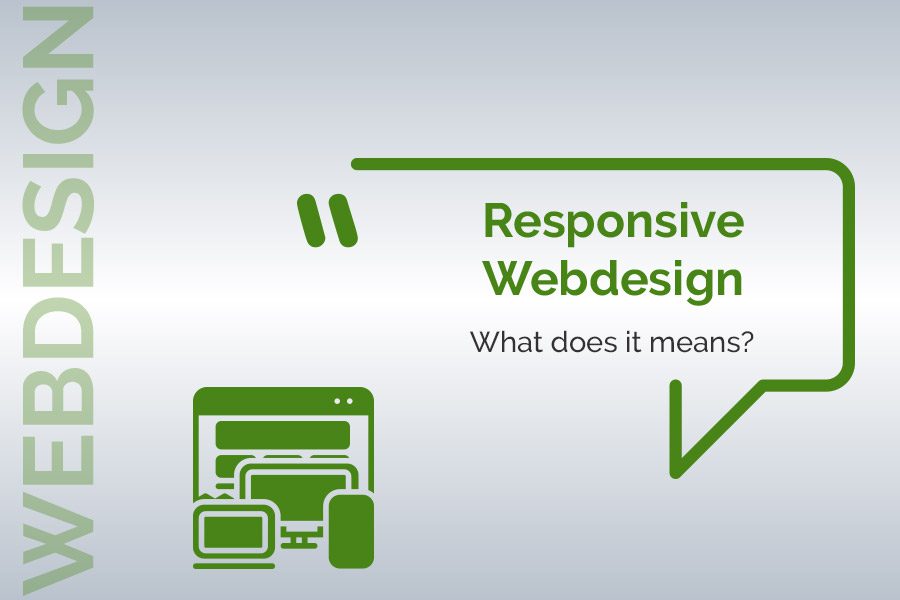
What is responsive design and what is its purpose?
September 23, 2019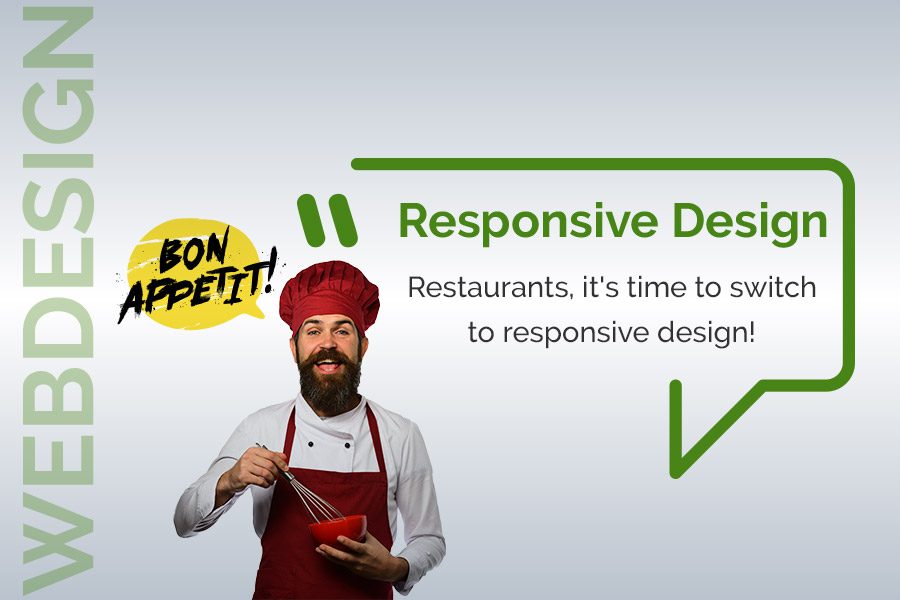

Having a website that is compatible with navigation from smartphones is a necessity that applies to every company. This evidence seems even more pronounced in the restaurant sector, where competition is particularly fierce and consumer habits have changed considerably.
Audience, reactivity, referencing… we have listed for you the arguments that show that the “responsive design” standard of restaurant sites is absolutely essential.
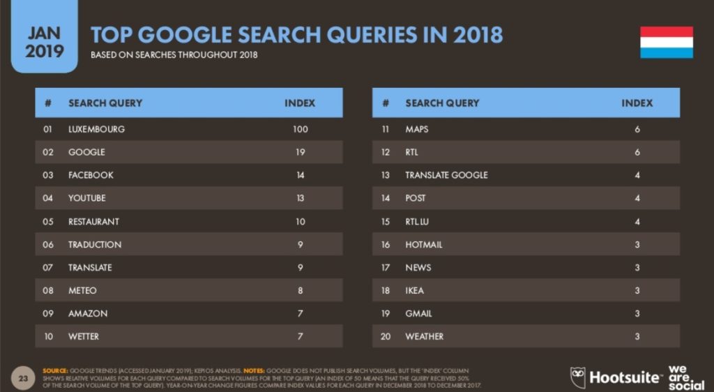
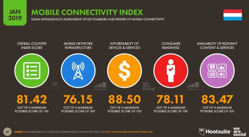
1 – Mobile navigation in Luxembourg
Let’s start with a few figures to illustrate what mobile navigation means in the Grand Duchy of Luxembourg. – The 2019 digital study published last January by the firm We are Social, indicates that 87% of the Luxembourg population (more than 500,000 people) use their smartphone to regularly surf the Internet. By way of comparison, these figures are “only” 78% in Germany, 77% in Belgium and 74% in France.

2 – Google promotes mobile friendly sites.
Not only are mobile friendly sites (another name for responsive design) better placed than non-optimized sites in Google’s results, but in addition, Google mobile (the version of the engine that is specific to smartphones), which has largely taken the place of traditional online directories, favours the right answers that are located near your connection point and whose sites are responsive design.
3 – Mobile navigation meets urgent and precise needs.
Damn, I forgot to buy flowers for dinner, here, I’d like to eat Thai for lunch, Oh shoot, my remote control is still broken…
Faced with these ordinary situations, but which need quick answers, we have made it a habit to draw our smartphone and ask Google to find the solutions for us. It is in these situations, which are often of an urgent nature, that having a website adapted to mobile navigation and well placed in Google’s geolocation results is of great interest.
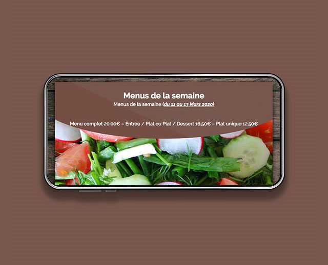
4 – Successful responsive design sites encourage contact.

A smartphone is useful for many things: playing, surfing, wasting time on facebook… but also telephoning.
A well-designed restaurant site should give its visitors the opportunity to contact it directly, right from the header of the site. Therefore, the phone number must be clickable to make a call without having to scroll down the page or exit the site. The same applies if, instead of, or in addition to the telephone, the site displays access to a contact form by e-mail or an online booking module.
Another essential function to remember to include on your site is the possibility of allowing visitors to locate you quickly and to know the itinerary to access your establishment. This function should preferably be incorporated in the footer and/or menu of the site.
5 – Mobile creates more links with your audience.
Mobile users have developed the habit of navigating between different sources of information before making their choice. Comments and opinions published on social networks (tripadvisor, facebook and google my business at the top) are therefore very popular with consumers because they allow them to take control of the decision-making process. A good integration of social networks on a site, as well as the proper management of comments and opinions published on it, has a direct impact on the credibility of an institution, its e-reputation, and the volume of visits.

