


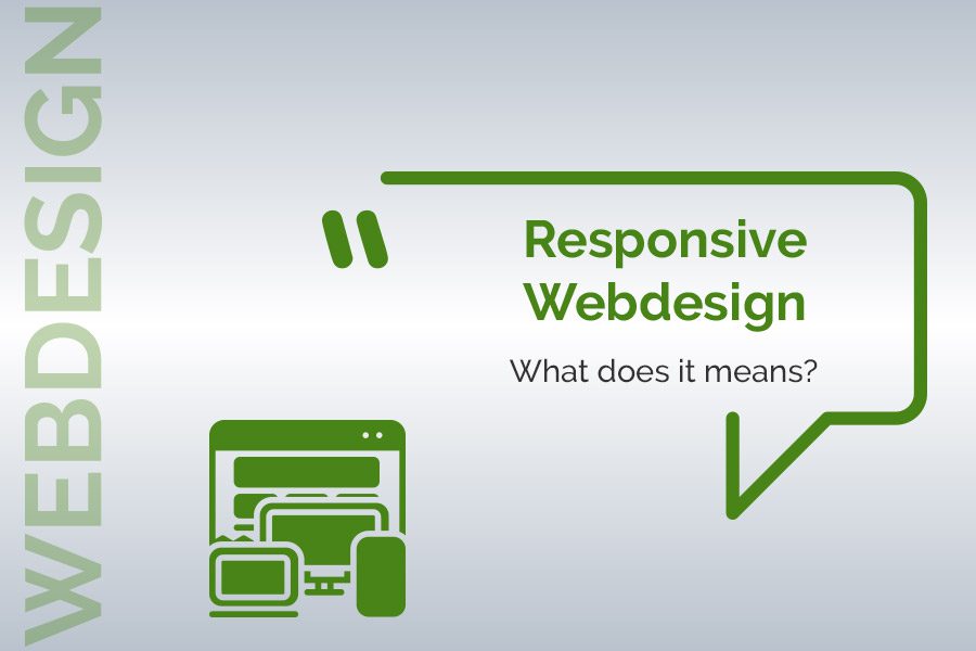
What is responsive design and what is its purpose?
In three years, smartphone traffic has increased by nearly 90%. According to a recent study, in 2019, global Internet traffic via computers accounted for 46% of the total, compared to 54% for mobile devices.
The observation is clear, even if the navigation on Desktop is still very present, it does not stop decreasing. So the question is no longer “Should I have a responsive site? “, but rather “When will I invest in a responsive site? ”


