
Role of SEO in Digital Marketing Success
February 23, 2026
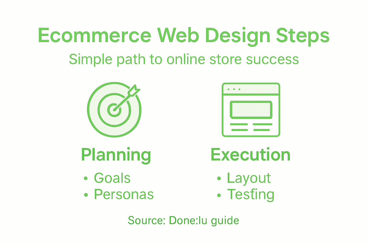
6 Essential Steps for a Website Design Checklist
February 25, 2026
Struggling to turn more website visitors into paying customers is a common challenge for Luxembourg e-commerce managers. Building an effective site starts with defining clear business goals and understanding your target audience, which drives every design decision and marketing effort. Without a data-driven foundation, your store risks missing the needs of the very people you want to reach. Discover how simple planning transforms directionless ideas into a focused path toward measurable sales growth.
Table of Contents
- Step 1: Define Business Goals And Target Audience
- Step 2: Plan Site Layout And Essential Features
- Step 3: Build Responsive Design And Optimize Content
- Step 4: Test Usability And Verify Performance
- Step 5: Launch Site And Monitor Results
Quick Summary
| Key Takeaway | Explanation |
|---|---|
| 1. Define specific goals | Clearly outline measurable business targets to guide your website design and marketing efforts. |
| 2. Understand your audience | Create detailed customer personas based on real data to effectively tailor products and marketing. |
| 3. Implement responsive design | Adopt a mobile-first approach to ensure seamless user experience across all devices. |
| 4. Conduct thorough testing | Usability and performance testing must identify any issues before your site goes live. |
| 5. Monitor metrics post-launch | Regularly review key performance indicators to adjust strategies and improve customer experience. |
Step 1: Define business goals and target audience
Your website needs clear direction before you build it. This step determines everything from design choices to product pricing to marketing strategy. Without knowing who you are selling to and what you want to achieve, you are essentially building in the dark.
Start by defining your business goals. What do you want your e-commerce site to accomplish? Are you aiming to increase online sales by 40% in the next year? Generate 500 qualified leads monthly? Build brand awareness in a specific region? Write these goals down with specific numbers and timeframes.
Next, shift focus to understanding your customers. Knowing your target audience is crucial for personalizing your marketing efforts and designing products that actually resonate. You need data, not guesses.
Define your target audience by analyzing:
- Demographics: age, gender, location, income level, education
- Behavior patterns: how they shop, what devices they use, when they buy
- Customer motivations: why they purchase, what problems they solve
- Pain points: what frustrates them about current solutions
Creating detailed customer personas based on surveys and analytics helps you understand your audience at a deeper level. A persona might look like: “Marie, 35, marketing manager in Luxembourg, shops on mobile at night, values sustainable products, budget of €100-300 per purchase.”
Use actual data. Pull information from your existing customers, Google Analytics, customer surveys, and competitor analysis. Real insights beat assumptions every time.
Accurate audience targeting boosts relevant traffic and high-value customer engagement, which are essential for e-commerce success.
This foundation determines how your designer approaches the site layout, which features get prioritized, and how your marketing campaigns speak to the right people.
Pro tip: Document your top 3-4 customer personas in writing before you start any design work, then reference them throughout your entire project to keep decisions aligned with who actually buys from you.
Step 2: Plan site layout and essential features
With your goals and audience defined, now comes the strategic design work. Your site layout and feature selection directly impact how customers navigate your store and complete purchases. This is where you turn insights into a functional, conversion-focused design.
Start by sketching your site structure. How will visitors move through your store? Most e-commerce sites use a grid or single-page layout model, depending on your product catalog size and shopping experience goals. A boutique selling 50 items might use a clean, single-page approach. A larger retailer with hundreds of products needs a more robust grid layout with multiple categories.

Here’s a comparison of single-page vs. grid layouts for e-commerce stores:
| Layout Type | Best For | Main Benefit |
|---|---|---|
| Single-Page | Small catalogs, boutique stores | Simple, focused shopping |
| Grid | Large catalogs, multiple categories | Easy product discovery |
Choosing the right layout aligns the site structure with your product range and customer expectations.
Next, identify your essential features. Key features for e-commerce websites include user-friendly navigation with breadcrumbs, advanced search functionality, and product filtering options. These aren’t optional. They directly reduce customer effort and improve conversion rates.
Build your feature checklist:
- Intuitive navigation so customers find products without frustration
- Responsive design that works perfectly on mobile, tablet, and desktop
- Product filtering by price, category, size, color, or other relevant attributes
- Optimized checkout process with minimal steps and clear calls-to-action
- Secured payment gateway that customers trust
- Search bar with autocomplete functionality
Consider how each feature serves your specific audience. If your target customers shop primarily on mobile at night, your checkout must work flawlessly on small screens. If they value sustainable products, feature sustainability filters prominently.
Think about page hierarchy. Your homepage needs clear pathways to top product categories. Product pages require high-quality images, detailed descriptions, and obvious add-to-cart buttons. Your checkout pages should be distraction-free with progress indicators showing where customers are in the process.
Effective e-commerce sites balance intuitive navigation, responsive design, and essential features to create engaging shopping experiences that drive conversions.
When planning, also consider how your site’s layout will support future growth. Can you easily add new categories? Scale your product inventory? Integrate new payment methods?
Pro tip: Wireframe your key pages (homepage, product page, checkout) before discussing design with your developer—this saves countless revision cycles and ensures everyone is aligned on functionality.
Step 3: Build responsive design and optimize content
Your site now needs to actually work across every device your customers use. Responsive design isn’t a luxury anymore—it’s the foundation of e-commerce success. This step ensures your store looks and functions beautifully on phones, tablets, and desktops.
Start with a mobile-first approach. Design for the smallest screen first, then expand upward to larger devices. Why? Most of your Luxembourg customers are shopping on phones. If your mobile experience is excellent, the desktop version naturally becomes even better.
Responsive web design adapts layouts fluidly across various devices, using flexible grids, scalable images, and CSS media queries to ensure consistent user experiences. This means your product images shrink and expand intelligently, your navigation reorganizes for touch, and your checkout buttons stay clickable on every screen size.
Here’s what you need to implement:
- Use fluid grid layouts instead of fixed pixel widths
- Optimize images so they load quickly without sacrificing quality
- Set CSS breakpoints for tablets (768px) and desktops (1024px+)
- Test touch interactions—buttons need to be at least 44 pixels tall
- Ensure forms work smoothly on small screens with appropriate input types
Content optimization goes hand-in-hand with responsive design. Your product descriptions need to be scannable on mobile, not dense walls of text. Use short paragraphs, bullet points, and clear headings. Product images should show zoom functionality on mobile so customers can inspect details.
Building a responsive e-commerce website with a mobile-first strategy emphasizing speed and simplicity directly boosts both customer satisfaction and SEO rankings. Faster loading times mean higher search visibility and fewer cart abandonments.
Speed and usability on mobile devices directly impact conversion rates and customer retention in e-commerce.
Test your site constantly on real devices. Use browser developer tools to simulate different screen sizes, but also grab an actual iPhone and Android device to see how it truly performs. What looks responsive in Chrome’s device simulator might behave differently in reality.
Pro tip: Compress all product images before uploading—use tools like TinyPNG or ImageOptim to cut file sizes in half without visible quality loss, which dramatically improves page speed on mobile connections.
Step 4: Test usability and verify performance
Your site is built. Now you need to verify it actually works the way you intended. Testing catches problems before customers encounter them—and nothing damages conversions faster than a broken checkout or confusing navigation.
Start with usability testing. Bring in real people who match your target audience and watch them use your site without guidance. Can Marie from your customer persona find a specific product in under 30 seconds? Can she complete a purchase without calling support? These answers reveal critical issues.
Combining expert analysis with real user feedback uncovers key areas for enhancement in site usability that even your best designer might miss. User testing reveals how real behavior differs from assumptions.
Conduct testing across these areas:
- Navigation: Can users find product categories intuitively?
- Search functionality: Do search results match what customers expected?
- Product pages: Is information clear, images visible, add-to-cart obvious?
- Checkout process: Can customers complete purchases without confusion?
- Error handling: What happens when something goes wrong?
Next, measure performance metrics. Page load speed directly impacts both user experience and search rankings. Slow sites lose customers. Use tools to monitor how quickly your pages load on different connections and devices.
Slow page load times harm user experience and conversion rates, making performance monitoring essential for e-commerce success. Test on real 4G connections, not just fast fiber internet.
Check these performance indicators:
- Page load time under 3 seconds on mobile
- Core Web Vitals scores in Google PageSpeed Insights
- Mobile vs desktop performance gaps
- Time to interactive for key pages
Regular testing and monitoring catch usability problems before they damage conversions and revenue.
Schedule testing throughout development, not just at the end. Early feedback prevents costly redesigns later.
Pro tip: Use heat mapping tools like Hotjar to see exactly where users click, scroll, and get stuck—this data reveals usability problems you’d never spot by guessing.
Step 5: Launch site and monitor results
Your e-commerce site is ready. Launch day arrives, and suddenly real customers start using your store. This is where theory meets reality. Your job now is to monitor performance closely and respond to what the data tells you.
Before you go live, prepare your launch checklist. Verify all payment gateways are processing correctly. Test email notifications for orders, confirmations, and shipping updates. Set up your analytics tools—Google Analytics, conversion tracking, and heat mapping software. You cannot manage what you do not measure.
On launch day, stay alert. Monitor your server for crashes. Watch your inbox for customer support requests. Check your analytics dashboard every few hours for the first 48 hours. Are visitors landing on your site? Are they finding products? Are they adding items to their carts?
After launch, focus on three core metrics:
Here’s a quick reference for typical e-commerce performance metrics and what they reveal:
| Metric | Indicates | Ideal Value |
|---|---|---|
| Conversion Rate | % of visitors who purchase | 2.5% or higher |
| Average Order Value | Revenue per completed transaction | $50 and above |
| Cart Abandonment Rate | % leaving checkout unfinished | Below 60% |
| Page Load Time | Seconds for page to fully display | Under 3 seconds |
Monitoring these metrics closely helps identify where your e-commerce site needs improvement.
- Conversion rate: What percentage of visitors actually purchase?
- Average order value: How much are customers spending per transaction?
- Cart abandonment rate: How many customers start checkout but leave?
Applying research findings through continuous data-driven decision-making helps optimize launch outcomes and guide improvements based on real performance. Do not rely on guesses. Let data drive your next moves.
Monitor these continuously and adjust accordingly. If your conversion rate is 1.2% but industry average is 2.5%, something needs fixing. If cart abandonment sits at 75%, your checkout process is broken. Use this feedback to iterate.
Ongoing monitoring post-launch through data collection and analysis helps businesses adapt strategies, improve usability, and maintain competitiveness. Your site is never truly finished. It evolves based on customer behavior.
Launch is the beginning, not the finish line. Success comes from listening to data and continuously improving what your customers actually experience.
Schedule weekly reviews during your first month. Monthly reviews after that. Track trends, not just snapshots. A slow week might not mean your site is broken—seasonal patterns matter.
Pro tip: Set up automated alerts in Google Analytics for sudden drops in traffic or spikes in bounce rate, so you catch problems within hours instead of discovering them days later.
Unlock Your E-commerce Potential with Expert Web Design
Building an e-commerce site that truly resonates with your target audience and converts visitors into loyal customers is no small feat. You need a clear strategy for defining business goals, a responsive and intuitive design that adapts seamlessly across devices, and ongoing testing to optimize performance. Common challenges like low conversion rates, cart abandonment, and slow mobile experiences can derail growth if not addressed with a tailored approach.
At Done.lu, we specialize in creating fully responsive, growth-driven e-commerce websites tailored to the unique needs of businesses in Luxembourg and across Europe. Our expert team ensures your site has intuitive navigation, optimized checkout flows, and mobile-first design—exactly the essential features outlined in “Step by Step Web Design for Ecommerce Success.” We combine strategic web development with targeted digital marketing solutions to help you boost conversions and enhance your online presence.
Ready to turn your e-commerce vision into a high-performing reality? Visit Done.lu today to explore how our comprehensive web design and digital marketing services can address your specific pain points and drive real business growth. Get started now and ensure your next website is built with your audience and success goals at the heart of every decision.
Frequently Asked Questions
What are the first steps to define my e-commerce website’s goals?
Start by clearly stating what you want your e-commerce site to achieve, such as increasing online sales by a specific percentage within a year or generating a set number of leads monthly. Write these goals down with measurable metrics and timelines to keep your project focused.
How can I identify my target audience for my e-commerce site?
Define your target audience by analyzing demographics, customer behavior patterns, and their purchasing motivations. Create detailed customer personas based on actual data to understand who you are selling to and how to engage them effectively.
What layout should I choose for my e-commerce website?
Choose a layout type based on your product catalog size. A grid layout works best for larger inventories, while a single-page layout is suitable for boutique stores with fewer items. Sketch your site structure to ensure easy navigation for customers.
How do I optimize my e-commerce site for mobile devices?
Implement a mobile-first approach by designing for smaller screens first and ensuring that all features function properly on mobile devices. Test how your site appears on various smartphones and ensure your checkout process is smooth on these smaller formats.
What key features should I include on my e-commerce site?
Include essential features like intuitive navigation, advanced search capabilities, and easy product filtering options to enhance the customer experience. Verify that your checkout process is optimized and secure to build trust with your customers.
How can I measure the success of my e-commerce website after launch?
Monitor key performance metrics such as conversion rate, average order value, and cart abandonment rate. Conduct regular reviews to identify trends and areas for improvement, responding to real data to boost your e-commerce success.


