
Why responsive design matters for your website in 2026
June 3, 2026
How to create digital campaigns that actually convert
June 5, 2026
TL;DR:
- Responsive web design automatically adapts a website’s layout, images, and navigation to fit any device, improving SEO and user experience. It consolidates domain authority, reduces maintenance costs by up to 30%, and future-proofs your online presence against emerging technologies. Businesses with properly maintained responsive sites see higher conversions, lower bounce rates, and stronger brand trust, ensuring growth and competitiveness.
Responsive web design (RWD) is defined as a development approach in which a website automatically adapts its layout, images, typography, and navigation to fit any screen size or device, using flexible grids, fluid images, and CSS media queries. For small and medium-sized businesses, the reasons to choose responsive websites go far beyond aesthetics. A single, well-built responsive site improves your search rankings, reduces operating costs, and converts more visitors into customers, regardless of whether they arrive on a desktop in the office or a smartphone on the go. The evidence from 2026 is clear: businesses that invest in responsive design fundamentals are better positioned to grow online than those still managing separate mobile and desktop versions.
Why choose responsive websites for SEO and search visibility
Google’s mobile-first indexing is the single most important reason to prioritise responsive design for your website’s search performance. Mobile-first indexing means Google uses the mobile version of your site to determine how it ranks in search results, not the desktop version. If your mobile experience is poor, your rankings suffer across all devices, including desktop.
A responsive website solves this by maintaining one URL and one codebase for all devices. This matters enormously for SEO because all your backlinks, social shares, and domain authority consolidate behind a single address. When you run a separate mobile site, typically on an "m.` subdomain, you split that authority in two. You also risk indexing confusion, where Google encounters different content on your mobile and desktop versions and struggles to determine which to rank.
The benefits of responsive design for search visibility include:
- Single URL consolidation: All inbound links point to one address, concentrating your domain authority rather than dividing it across multiple versions.
- Consistent content parity: Google’s crawler sees the same content on mobile and desktop, eliminating the risk of ranking penalties from mismatched pages.
- Improved crawl efficiency: One codebase means Googlebot crawls your site once, reducing wasted crawl budget on duplicate pages.
- Faster mobile rendering: Responsive sites built with performance in mind load quickly on mobile, which is a confirmed ranking signal.
- Avoidance of duplicate content: Separate mobile sites frequently generate duplicate content issues that require canonical tags to fix, adding technical debt.
Shopify’s guidance on mobile SEO best practices is direct: responsive design with a single codebase is the foundation of a mobile-friendly site, and no amount of speed optimisation will compensate for poor mobile structure. This is a point we reinforce with every client at Done. Getting the architecture right from the start prevents months of remedial SEO work later.
What user experience benefits do responsive websites deliver?
A responsive website delivers a fundamentally different experience to mobile visitors compared to a static or non-adaptive site. Mobile users spend roughly 2 minutes on a page versus approximately 5 minutes on desktop. That shorter window means every friction point, a button too small to tap, text that requires pinching to read, a form that breaks on a small screen, costs you a potential customer.
The user experience advantages of a well-built responsive site are measurable and sequential. Here is how they build on each other:
- Fluid layout adaptation: The page reflows to fit the screen width, so users never need to scroll horizontally or zoom in to read content. This is the baseline expectation for any modern site.
- Tap-friendly interaction design: Buttons, links, and calls to action are sized and spaced for fingers, not mouse cursors. High-visibility CTAs with large tap targets are confirmed to maintain engagement on mobile, where users browse faster and with less patience.
- Reduced bounce rate: Mobile bounce rates are 12% higher than desktop on non-optimised sites. Responsive sites that achieve an Interaction to Next Paint (INP) score under 200ms see measurably longer session durations and more complete user journeys.
- Core Web Vitals compliance: Google’s Core Web Vitals, specifically Largest Contentful Paint (LCP), Cumulative Layout Shift (CLS), and INP, directly measure the quality of the user experience. A responsive site built with performance in mind scores better on all three, which feeds back into both rankings and user satisfaction.
- Consistent navigation across devices: Menus, search functions, and internal links that work identically on all screen sizes reduce cognitive load. Users who can find what they need quickly are more likely to convert. Practical guidance on improving site navigability applies directly here.
Pro Tip: Test your site’s responsiveness on real devices, not just browser emulators. Emulators miss touch interaction issues, font rendering differences, and performance gaps that only appear on actual hardware.
The connection between responsive UX and user engagement online is not theoretical. We have seen clients reduce their mobile bounce rates by over 20 percentage points simply by rebuilding their site with a properly responsive framework and correcting tap target sizing throughout.

Does responsive design reduce maintenance costs and complexity?
For an SMB owner managing a website alongside everything else, the operational argument for responsive design is often the most persuasive. A single responsive site replaces the need to maintain two separate codebases, two sets of content, two hosting environments, and two rounds of security updates.
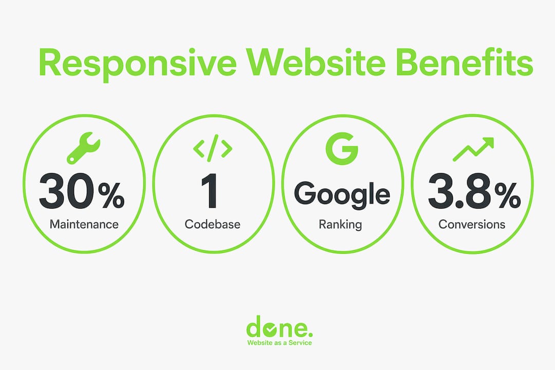
Responsive design cuts maintenance costs by up to 30% compared to managing separate mobile and desktop sites. That figure reflects real savings in developer time, hosting fees, and the hidden cost of keeping two versions synchronised. Every time you update a product page, a price, or a legal notice on a dual-site setup, you must make that change twice. Errors creep in. Content drifts out of sync. Customers on mobile see outdated information.
The comparison below illustrates the operational difference clearly:
| Factor | Responsive site | Separate mobile site |
|---|---|---|
| Codebases to maintain | One | Two |
| Content updates required | Single update | Duplicate update on both versions |
| Hosting environments | One | Two (often separate costs) |
| Security patching | One codebase to patch | Two codebases, doubled exposure |
| Duplicate content risk | None | High, requires canonical tag management |
| Future device compatibility | Adapts automatically | Requires new version per device type |
Beyond today’s devices, a responsive site also future-proofs your investment. As augmented reality browsers, foldable screens, and IoT display formats become more common, a site built on fluid grids and CSS media queries adapts far more gracefully than one hard-coded for specific screen dimensions. You are not building for the devices that exist today. You are building for the ones your customers will use in three years.
Pro Tip: When briefing a web developer, ask specifically whether the responsive build includes content parity testing on mobile. Visual adaptation is not the same as functional responsiveness. Custom plugins and third-party apps frequently break mobile layouts in ways that are invisible during desktop QA.
What measurable business outcomes come from responsive websites?
The business case for responsive design is grounded in conversion data, not assumptions. SiteGrade’s 2026 analysis of Core Web Vitals and conversion rates shows a direct and steep relationship between mobile load speed and revenue outcomes. Sites with an LCP under 1.5 seconds record a bounce rate of 26% and a conversion rate of 3.8%. Sites with an LCP over 6 seconds see bounce rates climb to 68% and conversions collapse to 0.7%. That is a fivefold difference in conversion rate based on load speed alone.
This data means that a slow, non-responsive site is not just a technical problem. It is a direct drag on revenue. For an e-commerce business generating €50,000 per month, the difference between a 3.8% and a 0.7% conversion rate is not marginal. It is the difference between a profitable site and one that barely justifies its existence.
The business outcomes that flow from a properly built responsive site include:
- Higher conversion rates: Faster load times and better mobile UX reduce friction at every stage of the purchase or enquiry journey.
- Lower cost per acquisition: When your site converts better, every euro spent on Google Ads, SEO, or social media goes further. Web design elements for conversion directly affect your marketing ROI.
- Stronger brand trust: Consistent branding across devices is linked to 10 to 20% annual revenue growth by 68% of companies surveyed by DesignRush. A site that looks professional on every screen signals reliability to first-time visitors.
- Better lead generation integration: Responsive sites integrate more cleanly with marketing automation tools, CRM platforms, and lead capture forms. A digital marketing workflow built around a responsive site performs measurably better than one patched onto a broken mobile experience.
- Reduced ad spend waste: Google Ads quality scores factor in landing page experience. A responsive, fast-loading landing page earns higher quality scores, which lowers your cost per click.
“Failure to maintain mobile UX leads to ‘mobile UX debt’ that compounds over time, negatively impacting user metrics and business results in ways that become progressively harder to reverse.” — SiteGrade, 2026
The concept of mobile UX debt is worth taking seriously. Every month a business operates with a poor mobile experience, it loses visitors who do not return, accumulates negative signals in Google’s ranking systems, and falls further behind competitors who have already invested in responsive web design for e-commerce and service sites alike.
Key takeaways
Responsive web design is the single most cost-effective investment an SMB can make in its online presence, because it simultaneously improves SEO, reduces operating costs, and increases conversion rates across all devices.
| Point | Details |
|---|---|
| SEO consolidation | A single URL and codebase concentrates domain authority and satisfies Google’s mobile-first indexing requirements. |
| Conversion impact | LCP under 1.5s delivers a 3.8% conversion rate; LCP over 6s drops it to 0.7%, per SiteGrade 2026 data. |
| Maintenance savings | Responsive design reduces maintenance costs by up to 30% compared to managing separate mobile and desktop sites. |
| Brand consistency | Consistent branding across devices is linked to 10 to 20% annual revenue growth for the majority of companies surveyed. |
| Future compatibility | Fluid grids and CSS media queries adapt automatically to new device formats, protecting your investment over time. |
The uncomfortable truth about “responsive” websites
I have been building and auditing websites for SMBs in Luxembourg since 2014, and the most common misconception I encounter is this: business owners assume that because their developer said the site is responsive, it actually is. In practice, that is frequently not the case.
True responsiveness, as Shopify’s technical guidance makes clear, requires confirmed content parity and full functionality on mobile-rendered pages. It is not just about the layout reflowing. Custom plugins, third-party booking tools, embedded forms, and chat widgets all have the potential to break the mobile experience in ways that are invisible during a desktop review. We have audited sites where the contact form was completely non-functional on mobile, and the client had no idea because nobody had tested it on an actual phone.
The second uncomfortable truth is that responsiveness is not a one-time achievement. It is an ongoing commitment. Every time you add a new plugin, update a theme, or integrate a new tool, you introduce the risk of breaking something on mobile. We track Core Web Vitals continuously for our clients precisely because the metrics drift. A site that scored well in January can degrade significantly by June if changes are made without mobile QA.
What I tell clients is this: ask your developer for a Core Web Vitals report on mobile, not just desktop. Ask them to demonstrate the site working on three different real devices. And build a process for re-testing after every significant update. The businesses we work with that treat responsiveness as a continuous standard, rather than a launch-day checkbox, consistently outperform those that do not. The data from SiteGrade confirms what we see in practice: the gap between a well-maintained responsive site and a neglected one widens every month.
— Thomas
How Done supports SMBs with responsive web development
If you are weighing whether to rebuild your site or invest in a first proper web presence, the responsiveness of the final product should be a non-negotiable requirement in your brief.

At Done, we build fully responsive websites for SMBs across Luxembourg and broader Europe, with every project tested against Core Web Vitals benchmarks on real devices before launch. Our approach combines web development expertise with ongoing performance monitoring, so your site does not just launch well. It stays well. Whether you need a new site, a performance audit of your existing one, or a full digital marketing setup built around a responsive foundation, we are ready to help. Contact Done for a straightforward assessment of where your site stands and what it would take to get it performing properly.
FAQ
What is responsive web design?
Responsive web design (RWD) is a development method in which a website automatically adapts its layout, images, and navigation to fit any screen size using flexible grids and CSS media queries. One site serves all devices without requiring separate versions.
How does responsive design affect Google rankings?
Google uses mobile-first indexing, meaning it ranks websites based on their mobile version. A responsive site with a single URL and consistent mobile content satisfies this requirement directly, while separate mobile sites risk indexing confusion and split domain authority.
Does a responsive website cost more to build?
A responsive site typically costs more upfront than a basic static site, but it costs significantly less to maintain. Managing one codebase rather than separate mobile and desktop versions reduces ongoing development, hosting, and content update costs by up to 30%.
What is the impact of page speed on conversions for mobile users?
SiteGrade’s 2026 data shows that sites with an LCP under 1.5 seconds convert at 3.8%, while sites with an LCP over 6 seconds convert at just 0.7%. Faster mobile rendering, which responsive design supports, directly increases sales and lead generation.
How do I know if my current website is truly responsive?
Run your site through Google’s PageSpeed Insights on mobile and check your Core Web Vitals scores for LCP, CLS, and INP. Then test all interactive elements, forms, buttons, and navigation on at least two real devices to confirm full functionality, not just visual adaptation.


