

Why use SEM for ecommerce: a practical 2026 guide
July 5, 2026
The role of SEM in digital campaigns: a practical guide
July 7, 2026
TL;DR:
- Improving user experience enhances engagement, satisfaction, and brand reputation for small and medium-sized businesses.
- Focusing on usability fundamentals like consistency, progressive disclosure, and clear labels reduces friction and boosts conversions.
User experience (UX) is defined as the quality of a person’s interaction with a digital product, covering ease of use, efficiency, and satisfaction. Knowing how to improve user experience is one of the highest-return investments an SMB can make. Poor usability does not just frustrate visitors. 44% of users share bad UX experiences with others, turning a website problem into a brand problem. The good news is that UX improvement follows a repeatable process grounded in ISO 9241-210, the international standard for human-centred design, and practical techniques like progressive disclosure, usability testing, and AI-driven personalisation. This article gives you the specific steps to apply them.
What foundational UX principles must SMBs prioritise?
Usability must come before aesthetics. A visually impressive website that confuses visitors loses business. The foundational principles of good UX are well established, and skipping them creates problems that no amount of visual polish can fix.
The core principles every SMB website needs:
- Consistency. Navigation labels, button styles, and interaction patterns must behave the same way across every page. Inconsistency forces visitors to relearn your interface at every step, which increases cognitive load and reduces confidence.
- Progressive disclosure. Show visitors only the information they need for the current step. Progressive disclosure reduces cognitive load and improves task completion rates by preventing information overload. A checkout flow that reveals address fields only after a product is selected is a simple example of this in practice.
- Accessibility and plain language. Write in the vocabulary your visitors use, not the vocabulary your industry uses. Accessibility is also a legal requirement under the European Accessibility Act, which affects SMBs trading in the EU.
- Meaningful labels on navigation icons. Minimalist icons without text raise cognitive load and harm usability. A shopping bag icon alone is ambiguous. “Shopping bag (3 items)” is not.
- Design systems for consistency. 68% of large companies use design systems to enforce visual and interaction consistency. SMBs do not need a full enterprise design system, but a shared set of reusable components, colours, and type styles achieves the same result at a fraction of the cost.
Pro Tip: Before redesigning anything, audit your current site for label consistency. Open five random pages and check whether the same action always uses the same button colour and wording. Inconsistencies here are quick wins.
Usability failures carry a real cost. When nearly half of all users share negative experiences publicly, a single broken checkout flow or confusing menu can generate negative word-of-mouth at scale. Treating usability as a strategic priority, not a design preference, is the correct framing for any SMB owner.
How can AI and data-driven techniques enhance functional UX?
AI is not a UX shortcut. Used correctly, it is a tool for making your digital platform more relevant and efficient for each individual visitor. Used poorly, it adds complexity without adding value.
The functional value of AI features matters more than their novelty. Perceived usefulness of AI features explains 39% of variance in customer satisfaction (CSAT) and 48% in Net Promoter Score (NPS). That means an AI chatbot that actually answers your visitors’ questions will move your NPS more than any visual redesign. An AI feature that feels gimmicky will drag it down.
Practical ways to use AI and data to improve UX:
- Reduce task completion time with AI assistance. Integrating AI models into digital interfaces reduces task completion time by 14% and increases click efficiency by 35%. For an SMB, that translates directly into more completed enquiry forms, more purchases, and fewer abandoned sessions.
- Show system status during AI processes. When an AI process takes longer than one second, visitors need a visible signal that something is happening. Loading indicators or skeleton screens maintain perceived competence and prevent visitors from assuming the page has broken.
- Use personalisation to increase relevance. Adaptive interfaces that surface content based on a visitor’s previous behaviour improve engagement. A returning visitor to a Luxembourg accountancy firm’s website should not see the same homepage as a first-time visitor. Personalisation does not require a large budget; even basic CMS tools support conditional content blocks.
- Collect CSAT and NPS data systematically. These two metrics give you a direct read on whether your UX changes are working. Run a short post-interaction survey after key actions such as form submissions or purchases. Track scores monthly and correlate them with specific design changes.
- Prioritise AI features based on user feedback. Build a short feedback loop into any AI-powered feature you deploy. If visitors consistently report that a chatbot is unhelpful, the feature is reducing, not improving, your UX. Remove or retrain it before it damages satisfaction scores.
You can read more about using AI tools for SME marketing to see how these principles apply in a digital marketing context. The connection between UX and SEO is also direct: UX improvements affect search rankings through signals like dwell time and bounce rate.
What steps should SMBs follow to systematically improve UX?
Improving website usability is not a one-off project. It is a cycle. The businesses that see lasting results treat UX as an ongoing operational discipline, not a launch-day checklist.

Step 1: Define your users and their goals.
Start with user research. Interview five to ten real customers about how they use your website and what they are trying to accomplish. You will almost certainly discover that their mental model of your site differs from yours. This gap is where most UX problems live.
Step 2: Map key user journeys and find friction points.
A user journey is the sequence of steps a visitor takes to complete a goal, such as requesting a quote or buying a product. Map the three most important journeys on your site. At each step, ask: where do visitors hesitate, go back, or drop off? Tools like Microsoft Clarity or Hotjar provide heatmaps and session recordings that make friction points visible without requiring a large research budget.
Step 3: Apply iterative design cycles.
The ISO 9241-210 standard for human-centred design specifies four phases: understand context, specify requirements, produce design solutions, and evaluate against requirements. For an SMB, this translates to: sketch a solution, build a prototype, test it with three to five real users, and refine. You do not need a full design agency to run this cycle. A clickable wireframe in Figma and a one-hour session with willing customers is enough to surface the most critical issues.
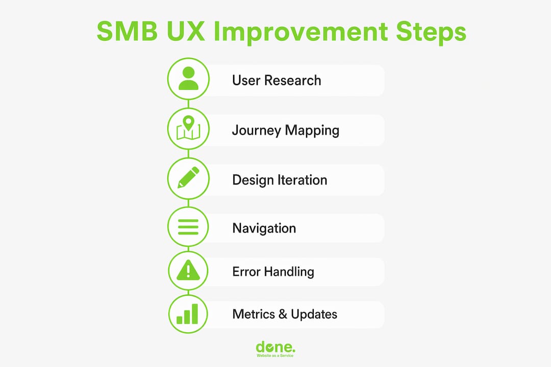
Step 4: Implement clear navigation and familiar patterns.
Visitors arrive at your site with expectations shaped by every other website they have used. Familiar patterns, such as a logo in the top left that links to the homepage, a persistent navigation bar, and a search field in the header, reduce the learning curve to zero. Resist the temptation to be original with navigation. Originality here costs you conversions.
Pro Tip: Run a five-second test on your homepage. Show it to someone unfamiliar with your business for five seconds, then ask them what the site does and what they should do next. If they cannot answer both questions, your homepage has a clarity problem.
Step 5: Add error prevention and helpful feedback messages.
Error messages that say “Invalid input” tell the visitor nothing useful. Error messages that say “Please enter a valid Luxembourg phone number, for example +352 123 456” solve the problem immediately. Every form on your site should validate inputs in real time and explain exactly how to correct mistakes.
Step 6: Track metrics and iterate.
The metrics that matter most for UX are task completion rate, time on task, bounce rate on key pages, and CSAT scores. Set a baseline before making changes, then measure again after each iteration. A structured approach to digital marketing strategy will show you how UX metrics connect to broader business outcomes.
| Metric | What it measures | How to collect it |
|---|---|---|
| Task completion rate | Whether visitors achieve their goal | Usability testing, analytics funnels |
| Time on task | Efficiency of the interface | Session recording tools |
| Bounce rate | Whether landing pages meet expectations | Google Analytics 4 |
| CSAT score | Visitor satisfaction after key actions | Post-interaction survey |
| NPS | Likelihood to recommend | Periodic email survey |
What common UX pitfalls should SMBs avoid?
The most expensive UX mistakes are the ones that feel like improvements. Stripping back a design to look modern, adding features because a stakeholder requested them, or copying a competitor’s layout without understanding why it works are all common paths to a worse experience.
Watch out for these specific traps:
- Treating UX as purely visual design. UX covers the entire interaction, including page load speed, error handling, form behaviour, and content clarity. A beautifully designed page that loads slowly or uses confusing labels still fails on UX.
- Building features based on stakeholder opinions alone. Usability must come first; adding features without user research often fails to solve actual user problems. The stakeholder who wants a homepage video autoplay is not the person who will leave your site because of it.
- Inconsistent design elements. A button that is blue on one page and green on another signals to visitors that something is wrong. Inconsistency erodes trust faster than most SMB owners realise.
- Overloading pages with information. Every additional element on a page competes for attention. Apply progressive disclosure: show the summary, let visitors request the detail. This is especially important on mobile, where screen space is limited.
- Ignoring AI response times. If your AI-powered chat or search tool takes more than one second to respond without showing a progress indicator, visitors assume it has failed. This is a fixable technical issue that has a direct impact on satisfaction.
“The biggest UX mistake SMBs make is assuming that because they understand their own website, their customers do too. Your familiarity with your own product is the single biggest obstacle to seeing it clearly. User research is the antidote.”
Troubleshoot UX problems by running moderated usability tests quarterly and reviewing behavioural metrics monthly. A single usability test with five participants typically uncovers the majority of critical issues on any given page.
Key takeaways
Improving user experience requires usability as the foundation, functional AI features that solve real tasks, and a continuous cycle of testing and iteration grounded in real user data.
| Point | Details |
|---|---|
| Usability before aesthetics | Usability failures cause brand damage; 44% of users share bad experiences publicly. |
| Progressive disclosure reduces friction | Show only the information needed at each step to lower cognitive load and improve completion rates. |
| AI features must be functionally useful | Perceived usefulness of AI explains 48% of NPS variance; gimmicky features reduce satisfaction. |
| Iterate with real users | Map journeys, test with five users, and refine before investing in full builds. |
| Track the right metrics | CSAT, NPS, task completion rate, and bounce rate give you a direct read on UX health. |
What I have learnt from 10 years of UX projects with SMBs
The most common mistake I see is treating a website redesign as a UX project. It is not. A redesign changes the visual layer. UX improvement changes how people think and feel when they use your site. Those are different problems with different solutions.
We have worked with clients who spent significant budgets on new designs, only to see conversion rates stay flat, because the underlying navigation logic, form structure, and content hierarchy were never addressed. The visual refresh felt good internally. Visitors did not notice.
The projects that delivered measurable results shared one characteristic: they started with user research. Not surveys sent to an email list, but actual conversations with real customers about what they were trying to do and where they got stuck. That research consistently revealed problems that no one inside the business had noticed, because internal teams are too familiar with their own products to see them clearly.
I am also cautious about AI features for their own sake. Emotional engagement in AI-driven interactions does improve retention, but only when the underlying usability is solid. An AI chatbot on a site with broken navigation is a distraction, not an improvement. Fix the foundation first.
The practical advice I give every client is this: pick one user journey, test it with five people who have never seen your site, and fix what you observe. Do that every quarter. After a year, you will have a materially better website than any one-off redesign would have produced.
— Thomas
How Done can help you build a better digital experience
Done is a Luxembourg-based digital and AI agency with over 350 completed projects for SMBs across Europe. We specialise in web development, UX-led design, and AI integration for businesses that need practical results, not theoretical frameworks.
If you are ready to move beyond generic advice and apply a structured UX improvement process to your website, our team can help you audit your current platform, identify the highest-impact changes, and build or rebuild with usability at the centre. We apply Growth Driven Design methodology, which means your site improves continuously rather than waiting for the next full redesign cycle. Understanding why web development investment matters is the first step toward making that case internally. Contact Done to discuss your project.
FAQ
What does improving user experience actually mean?
Improving user experience means making your digital platform easier, more efficient, and more satisfying to use. It covers navigation clarity, content structure, page speed, error handling, and the functional value of any AI or interactive features.
How do I know if my website has a UX problem?
Track task completion rates, bounce rates on key pages, and CSAT scores after important interactions. A high bounce rate on a product or service page, or a low form completion rate, typically signals a usability issue worth investigating.
How does UX affect SEO for SMBs?
UX signals such as dwell time, bounce rate, and page speed directly influence search rankings in Google. A site that visitors leave quickly sends a negative quality signal, which reduces organic visibility over time.
How often should SMBs run usability tests?
Run moderated usability tests at least quarterly, with five participants per round. Five participants is enough to surface the majority of critical issues on any given page, according to established usability research.
What is the fastest UX improvement an SMB can make today?
Add text labels to all navigation icons, check that every error message explains exactly how to fix the mistake, and confirm that your most important page loads in under three seconds on a mobile connection. These three changes address the most common usability failures with minimal development effort.