
Examples of e-commerce platforms for SMBs in 2026
June 2, 2026
Why choose responsive websites for your business
June 4, 2026
TL;DR:
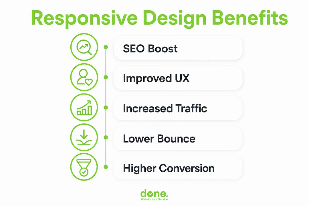
- Responsive design enables a website to adapt seamlessly to any device using a single codebase and URL, ensuring optimal user experience and SEO performance. It is the foundation for mobile-first indexing, content visibility, and better Core Web Vitals metrics, which directly impact search rankings and conversions. Adopting a systemic, mobile-first approach with best practices like fluid grids, media queries, and responsive images is essential for maintaining long-term site effectiveness.
Responsive design is the approach that allows a website’s layout and content to automatically adjust to any screen size or device, from a 5-inch smartphone to a 27-inch desktop monitor, using a single codebase and one URL per page. This is not a cosmetic feature. It is the technical foundation that determines whether Google indexes your site correctly, whether visitors stay or leave, and whether your marketing investment produces returns. Responsive design best practices are built on three core technologies: CSS media queries, fluid grids, and flexible images. Without them, no amount of SEO work, paid advertising, or content marketing fully compensates for a broken mobile experience.
Why responsive design matters for SEO and mobile-first indexing
Google switched to mobile-first indexing as its default crawling method, which means it evaluates the mobile version of your site to determine rankings. If your mobile experience is poor, your desktop rankings suffer too. This is the single most misunderstood consequence of ignoring mobile performance.
Responsive design is the foundation of mobile-first indexing because it provides one unified theme, one URL per page, and one codebase. Google requires this consistency for accurate mobile ranking. A site built on a separate mobile subdomain or a patchwork of device-specific redirects creates conflicting signals that confuse the crawler and dilute ranking authority.
Content parity is equally critical. Google indexes the mobile HTML DOM, so any content hidden on mobile, whether through CSS display:none or lazy-loading without proper markup, may not be crawled or ranked. If your product descriptions, testimonials, or key service pages are hidden on mobile to save space, you are effectively removing them from Google’s index.
Core Web Vitals compound this further. Google’s performance metrics, Largest Contentful Paint, Interaction to Next Paint, and Cumulative Layout Shift, are measured primarily on mobile and directly affect search rankings. Responsive design, when implemented correctly, improves these scores through flexible layouts and properly optimised assets. A site that loads slowly on mobile or shifts its layout as images load will score poorly on all three metrics, regardless of how fast it performs on desktop.
“Without responsive design, no speed optimisation fixes mobile-first indexing issues.” — Shopify
The practical implication is straightforward. If you are investing in SEO, Google Ads, or content marketing, a non-responsive site is undermining every euro you spend. The traffic arrives, the page fails to load correctly on a phone, and the visitor leaves. The ad budget is wasted. The SEO effort is wasted.
How does responsive design improve user experience?
Mobile users and desktop users behave differently, and your site needs to account for both without maintaining two separate builds. Mobile users spend around 2 minutes on a page compared with approximately 5 minutes for desktop users. That compressed window means your mobile layout must surface the most important content immediately, with no friction.
The practical differences in mobile behaviour that responsive design must address are:
- Tap navigation instead of click navigation. Touch targets need to be large enough to tap accurately. A navigation menu designed for a mouse cursor becomes unusable on a touchscreen if the links are too small or too close together.
- Vertical scrolling as the primary interaction. Mobile users scroll vertically. Horizontal scrolling, awkward zooming, or content that overflows the screen width are immediate reasons to leave.
- Shorter attention spans and faster decisions. Mobile visitors are often on the move. They need headlines, prices, contact buttons, and calls to action within the first screen view, not buried below three paragraphs of introductory text.
- Variable network conditions. Mobile connections are slower and less stable than broadband. A page that loads in 2 seconds on a desktop may take 8 seconds on a 4G connection if images are not optimised for mobile delivery.
Responsive design addresses all four by using fluid grids that reflow content based on screen width, media queries that apply different layout rules at defined breakpoints, and flexible images that scale within their containers. The result is a site that feels purpose-built for each device, even though it is a single codebase.
The impact on engagement metrics is measurable. Sites with poor mobile experiences see higher bounce rates, lower pages-per-session, and reduced conversion rates. Improving website navigability on mobile is one of the fastest ways to recover lost engagement from visitors who would otherwise have converted.

Pro Tip: Design your mobile layout first, then scale up to desktop. This forces you to prioritise the content that genuinely matters and removes the temptation to fill space with secondary information. The result is a cleaner, faster experience on every device.
What are the technical best practices for responsive design?
Responsive design is not a separate technology but a set of best practices applied within standard web development. Understanding what those practices are, and where they are commonly misapplied, is what separates a site that works on mobile from one that merely looks acceptable on a small screen.
The core technical components are:
- The viewport meta tag. Without "` in the HTML head, mobile browsers render the page at desktop width and scale it down. This single missing line causes the zoomed-out, unreadable mobile experience that many older sites still deliver.
- Fluid grids. Layouts built with percentage-based widths or CSS Grid and Flexbox reflow naturally as the viewport changes. Fixed-pixel layouts break at screen widths they were not designed for.
- CSS media queries. These apply different style rules at defined breakpoints, for example switching a three-column layout to a single column below 768 pixels. Strategic breakpoints should be defined by where the content breaks, not by specific device dimensions, since device sizes change constantly.
- Responsive images with srcset and sizes. Serving a 2,000-pixel-wide image on a 375-pixel screen wastes bandwidth and harms Core Web Vitals. The
srcsetattribute tells the browser which image file to download based on the device’s screen resolution and viewport width. Improper image scaling wastes bandwidth and harms Core Web Vitals scores, a known SEO ranking factor. - Accessible touch targets. The Web Content Accessibility Guidelines (WCAG) recommend a minimum touch target size of 44×44 pixels. This is both an accessibility requirement and a usability standard for mobile visitors.
The most common pitfall is treating responsive design as a series of one-off CSS overrides rather than a systemic approach. A developer adds a fix for one screen size, then another fix for a different device, and within six months the stylesheet is a collection of conflicting rules that nobody wants to touch. Fragile one-off CSS hacks are difficult to maintain and scale, and they tend to break when a new device category emerges.
The comparison below illustrates the difference between a systemic approach and a patched one:
| Approach | Maintainability | SEO impact | Performance |
|---|---|---|---|
| Fluid grid with strategic breakpoints | High: changes propagate consistently | Positive: clean HTML structure | Good: fewer render-blocking rules |
| Fixed-pixel layout with CSS overrides | Low: each fix risks breaking others | Neutral to negative: inconsistent rendering | Poor: bloated stylesheet |
| Separate mobile stylesheet | Medium: two files to maintain | Risky: content parity issues | Variable: depends on loading strategy |
Testing is not optional. A site that looks correct in Chrome’s device emulator may still break on a real Samsung Galaxy or an older iPhone. Cross-browser and cross-device testing using tools such as BrowserStack or real device labs catches the edge cases that emulators miss.
Pro Tip: Treat responsive design as systems design. Define your breakpoints, grid system, and type scale at the start of a project and document them. Every future change should work within that system, not around it.
Responsive design vs adaptive design vs separate mobile sites
These three approaches solve the same problem, delivering a usable experience across devices, but they do so in fundamentally different ways, with different consequences for SEO, maintenance, and user experience.
Responsive design uses a single codebase and a single URL. The layout adapts fluidly to any screen size through CSS. Google crawls one page, one set of content, and one set of signals.
Adaptive design serves different fixed layouts based on detected screen size or device type. The server detects the device and delivers a pre-built template. This can produce highly optimised experiences for specific device classes, but it requires maintaining multiple templates and introduces the risk of content diverging between versions.
Separate mobile sites use a distinct subdomain, typically m.example.com, with different URLs and often different content. Separate mobile sites are ranking liabilities and should be migrated to responsive design with 301 redirects to canonical URLs. Mobile-first indexing requires one URL per page, and user-agent sniffing to swap content creates exactly the kind of inconsistency Google penalises.
| Approach | Single URL | SEO risk | Maintenance cost | Best for |
|---|---|---|---|---|
| Responsive design | Yes | Low | Low: one codebase | Most websites and SME marketing sites |
| Adaptive design | No | Medium: content parity risk | High: multiple templates | High-traffic sites with distinct mobile content needs |
| Separate mobile site | No | High: duplicate content, ranking dilution | Very high: two full sites | Legacy situations requiring urgent migration |
For the vast majority of SME websites and marketing sites, responsive design is the correct choice. It is the approach recommended by Google, supported by every major CMS including WordPress and Shopify, and the one that requires the least ongoing maintenance. Adaptive design has legitimate use cases, for example a complex web application where mobile and desktop workflows are genuinely different, but those cases are rare for typical business websites.
The risks of maintaining a separate mobile site in 2026 are significant. Mobile-first indexing requires the mobile HTML to contain all content Google should index. A separate mobile site that strips out content for simplicity is actively harming its own rankings.
Key takeaways
Responsive design is the single most impactful technical decision a business website can make, because it determines SEO performance, user engagement, and conversion rates across every device simultaneously.
| Point | Details |
|---|---|
| SEO depends on mobile quality | Google ranks based on the mobile version; a poor mobile experience harms all rankings. |
| One codebase, one URL | Responsive design avoids duplicate content risks and simplifies long-term maintenance. |
| Content parity is non-negotiable | Hidden mobile content is not indexed by Google and loses ranking value. |
| Responsive images save bandwidth | Use srcset and sizes to serve correctly sized images and protect Core Web Vitals scores. |
| Design mobile-first | Starting with mobile forces content prioritisation that improves the experience on all devices. |
What I have learned from 10 years of responsive builds
After working on over 150 web projects across Luxembourg and broader Europe, the pattern I see most consistently is this: businesses invest heavily in content and advertising, then lose the return because their site fails on mobile. It is rarely a dramatic failure. It is usually a navigation menu that is slightly too small to tap, a form that requires horizontal scrolling, or a hero image that takes 9 seconds to load on a phone. Small frictions that compound into lost conversions.
The second pattern is treating responsive design as a one-time project rather than an ongoing discipline. A site that is fully responsive at launch can drift over time as new content, plugins, and design changes are added without testing on mobile. We have seen clients whose sites scored well on mobile in year one and were broken by year three, simply because nobody was checking.
The insight that changed how we approach projects is that mobile-first design forces discipline. When you design for a 375-pixel screen first, you cannot hide behind a wide layout. Every element has to earn its place. The result is almost always a cleaner, faster site on desktop too, not just on mobile.
My practical advice: schedule a mobile audit every quarter. Open your site on a real phone, not a browser emulator, and complete the three most important actions a visitor would take. If any of those actions is frustrating, that is where you start. Do not wait for your analytics to tell you something is wrong. By the time the bounce rate rises, you have already lost the conversions.
— Thomas
How Done can help you build a site that works on every device
Done is a Luxembourg-based web and digital agency with over a decade of experience building mobile-first responsive websites for SMEs across multiple sectors. Every site we build uses a structured breakpoint system, fluid grids, and properly optimised media from day one, not as an afterthought.

We work with business owners and marketing teams who want a site that performs well in search, converts visitors across all devices, and does not require constant firefighting to maintain. Our approach combines professional web development with Growth Driven Design methodology, meaning your site improves continuously based on real user data rather than being rebuilt every three years. If your current site is losing mobile visitors, we can audit it and show you exactly where the problems are.
Get in touch with Done to discuss your project.
FAQ
What is responsive web design?
Responsive web design is an approach where a website’s layout and content automatically adjust to fit any screen size using CSS media queries, fluid grids, and flexible images. It uses a single codebase and one URL per page, making it the standard recommended by Google.
Does responsive design affect Google rankings?
Yes, directly. Google uses mobile-first indexing, meaning it evaluates the mobile version of your site to determine search rankings. A non-responsive or poorly performing mobile site will rank lower, regardless of how well the desktop version performs.
What is the difference between responsive and adaptive design?
Responsive design uses one fluid codebase that adjusts to any screen size. Adaptive design serves fixed templates based on detected device type. Responsive design is lower maintenance, carries less SEO risk, and is the recommended approach for most business websites.
How do I know if my site is truly responsive?
Open your site on a real mobile device and complete your three most important user actions. Also check Google Search Console for mobile usability errors and run a Core Web Vitals report, which measures performance on mobile specifically. Browser emulators are useful but do not replace real-device testing.
Why do responsive images matter for performance?
A site that visually scales a large desktop image on mobile still downloads the full file, wasting bandwidth and slowing load times. Using the srcset attribute serves smaller image files to smaller screens, directly improving Core Web Vitals scores and the overall mobile experience.


