
Why invest in inbound marketing: a 2026 guide for SMBs
June 19, 2026
TL;DR:
- Mobile-first design starts with the smallest screen to prioritize essential content and enhance performance. It directly influences search rankings, user engagement, and conversion rates by ensuring a purposeful mobile experience. Responsive design adapts layouts technically but does not guarantee a strategic mobile-first approach.
Mobile-first design is the practice of designing a website or application starting with the smallest screen, then scaling up to larger displays. Rather than shrinking a desktop site down to fit a phone, you build from the constraints of mobile outward. Google’s mobile-first indexing means your mobile experience is now the version that determines your search ranking, not your desktop site. Frameworks like Material Design from Google and Apple’s Human Interface Guidelines are built around this principle. Tools like Figma make it straightforward to prototype in mobile frames from day one. Getting this right is no longer optional for any business that depends on organic traffic or online conversions.
What is mobile-first design and why does it matter in 2026?
Mobile-first design is defined as a design and development philosophy that begins with the mobile experience as the primary product, not an afterthought. The Interaction Design Foundation describes it as designing for the smallest screen first, which reduces interface clutter by 50–70% and forces teams to focus on what genuinely matters to users.
That constraint is the point. When you have limited screen space, you cannot afford decorative elements, redundant navigation, or content that serves no clear purpose. Every pixel must earn its place. The result is a cleaner, faster, and more purposeful product than you would ever produce by starting with a desktop canvas and trying to compress it later.
For business owners, the practical implication is direct. Your customers are already on mobile. If your site loads slowly, presents cluttered navigation, or buries key calls to action beneath scrolling content, they leave. The design philosophy exists to prevent exactly that outcome.
What are the core principles of mobile-first design?
The mobile-first approach rests on a set of concrete design and technical standards. Understanding them helps you evaluate whether a project is genuinely mobile-first or simply responsive.
Content prioritisation above everything else
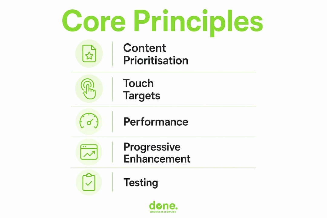
The first principle is ruthless content prioritisation. Mobile constraints force better decisions than desktop freedom ever does. You must decide what the user needs most, and present only that. Secondary content moves lower or disappears entirely. This is not a limitation. It is a discipline that produces better products.
Touch targets and thumb zones
Mobile UI standards require a minimum touch target size of 48×48 dp for interactive elements, according to UXPin’s mobile UI guidelines. Primary actions should sit within the bottom 40% of the screen, where thumbs naturally rest on a held device. Placing your most important button at the top of a long page is a common mistake that real device testing exposes immediately.
Performance as a design feature
Performance is not a developer concern added at the end. It is a design decision made at the start. Users expect pages to load in under 2 seconds, and any delay above 100 milliseconds registers as sluggish. Images must be compressed, fonts subset, and third-party scripts deferred or removed. These choices happen in the design phase, not after launch.
CSS written mobile-outward
On the technical side, mobile-first means writing CSS with base styles targeting small screens, then using min-width media queries to add complexity for larger breakpoints. The opposite approach, starting with max-width queries, is the desktop-first pattern and produces heavier, harder-to-maintain code.
- Write base styles for mobile screens first
- Add
min-widthbreakpoints for tablet and desktop enhancements - Avoid loading large desktop assets on mobile connections
- Use system fonts or variable fonts to reduce font load weight
- Defer non-critical JavaScript to improve perceived speed
Pro Tip: Test your CSS on a throttled 3G connection in Chrome DevTools before you test on broadband. What feels fast on your office Wi-Fi can feel broken on a commuter’s phone.
How does mobile-first design affect SEO and user engagement?
The SEO case for mobile-first design is not theoretical. Google switched to mobile-first indexing as its default ranking method, meaning the mobile version of your site is what Google crawls, indexes, and uses to determine your position in search results. If your mobile experience is poor, your rankings suffer regardless of how polished your desktop site looks.
The user engagement data reinforces this. Poor mobile usability leads to bounce rates five times higher than on well-optimised mobile sites. A bounce is a lost visitor, and in most cases, a lost customer. High bounce rates also signal to Google that your page did not satisfy the search intent, which compounds the ranking damage.
The relationship between UX and SEO is now direct and measurable. Google’s Core Web Vitals metrics, including Largest Contentful Paint, Cumulative Layout Shift, and Interaction to Next Paint, are all measured on mobile. A site that fails these metrics loses ranking ground to competitors who pass them.
For business owners, the practical checklist looks like this:
- Confirm Google Search Console shows no mobile usability errors on your site
- Check your Core Web Vitals report for mobile specifically, not desktop
- Verify that your most important conversion actions are reachable without horizontal scrolling
- Test your site on a mid-range Android device, not just an iPhone or a desktop emulator
- Measure your mobile page speed using Google PageSpeed Insights and target a score above 80
The web design elements that drive conversions on desktop often need to be restructured entirely for mobile. A sticky header with five navigation items becomes a hamburger menu. A three-column feature grid becomes a single-column stack. These are not cosmetic changes. They are the difference between a visitor converting and a visitor leaving.
Mobile-first design vs responsive design: what is the difference?
This is the most common point of confusion we encounter with clients. The two terms are related but not interchangeable. Responsive design is the technical implementation. Mobile-first design is the strategic philosophy behind it. A site can be fully responsive without being mobile-first, and that distinction has real consequences for user experience.
A responsive site adapts its layout to different screen sizes using fluid grids and media queries. That is the “what.” Mobile-first is the “how”: the decision to design and build for mobile users first, then progressively enhance the experience for larger screens. A site built desktop-first and then made responsive often carries the weight of desktop assumptions into mobile. Large hero images, complex navigation structures, and content-heavy layouts get squeezed rather than rethought.
The result is a site that technically works on mobile but does not feel right. Buttons are too small, text is too dense, and the most important content is buried beneath elements that made sense on a wide screen but serve no purpose on a narrow one.
| Dimension | Mobile-first design | Responsive design |
|---|---|---|
| Definition | Design philosophy starting with mobile | Technical method for adapting layouts |
| Starting point | Smallest screen, then scale up | Often desktop, then scale down |
| Content approach | Prioritise and remove ruthlessly | Adapt existing content to fit |
| CSS approach | min-width media queries |
Often max-width media queries |
| UX outcome | Purpose-built mobile experience | Variable; depends on starting point |
| SEO alignment | Directly supports mobile-first indexing | Supports it only if built mobile-first |
You can read more about what responsive design means and how it fits into a broader web strategy. The short version: responsive design is the floor, not the ceiling. Mobile-first is what you build on top of it.
Pro Tip: If a client insists on designing desktop layouts first, ask them to show you their Google Analytics mobile traffic percentage. In most cases, mobile accounts for more than half of their sessions. That number usually ends the conversation.
How to implement a mobile-first strategy effectively
Implementing a mobile-first approach is as much about process and stakeholder alignment as it is about technical execution. Here is a practical framework that works across projects of different sizes and budgets.
1. Start with mobile personas and user journeys
Before opening Figma or Sketch, define who your mobile user is and what they are trying to accomplish. A mobile visitor to a restaurant site wants the phone number and opening hours within two taps. A mobile visitor to a B2B software site may want a product overview and a demo request form. The journey determines what content is essential and what can wait for a larger screen.
2. Design in mobile frames first
Open Figma and set your first artboard to 375 pixels wide, the standard iPhone viewport. Design the complete mobile experience before you touch a tablet or desktop frame. This forces every design decision to be justified at the smallest scale. When you later expand to 768 pixels and then 1280 pixels, you are adding, not subtracting.

3. Agree on content priorities with stakeholders before design begins
Content prioritisation is the hardest part of any mobile-first project. Stakeholders often want everything on the homepage. The mobile constraint makes that impossible, and that is useful. Use the mobile frame as a negotiating tool. If something does not fit on mobile, ask whether it truly needs to be there at all. This conversation, held early, prevents expensive redesigns later.
4. Test on real devices throughout the process, not just at the end
Emulators cannot replicate real-world ergonomics or network conditions. A button that looks fine in Chrome DevTools may be unreachable with a thumb on a physical device. Test on at least three devices: a small Android phone, a mid-range iPhone, and a tablet. Test on a mobile data connection, not just Wi-Fi. You will find issues that no emulator would surface.
5. Progressively enhance for larger screens
Once your mobile experience is solid, add complexity for larger viewports. Multi-column layouts, expanded navigation, richer imagery, and supplementary content all belong at the tablet and desktop level. This is the correct direction of travel. Early performance optimisation at the mobile stage is 2–3 times less labour-intensive than retrofitting a desktop-first site later.
6. Use skeleton screens and optimised assets to manage perceived speed
Perceived performance matters as much as actual load time. Skeleton screens, which show a grey placeholder layout while content loads, reduce the feeling of waiting. Compress images using WebP format, lazy-load below-the-fold content, and serve appropriately sized images using the srcset attribute. These techniques keep the experience feeling fast even on slower connections.
Pro Tip: Use Lighthouse in Chrome DevTools to audit your mobile performance score before every major release. Set a team rule: no deployment if the mobile score drops below 80. It takes five minutes and prevents a lot of post-launch firefighting.
Keeping up with web design trends in 2026 also helps you understand which patterns are becoming standard on mobile and which are falling out of favour with users.
Key takeaways
Mobile-first design is the single most effective way to build websites that perform well in search, retain mobile visitors, and convert them into customers.
| Point | Details |
|---|---|
| Design from mobile outward | Start every project in a 375px frame before touching desktop layouts. |
| Content prioritisation is the core discipline | Agree on what is essential for mobile users before design begins, not after. |
| Mobile-first and responsive are not the same | Responsive is the technical method; mobile-first is the strategic starting point. |
| Google ranks your mobile experience | Mobile-first indexing means poor mobile UX directly damages your search position. |
| Real device testing is non-negotiable | Emulators miss ergonomic and network issues that only appear on physical devices. |
Why I think most teams get mobile-first backwards
After working on well over 150 web projects at Done, I have seen the same pattern repeat itself. A team agrees to go mobile-first, then spends three weeks designing beautiful desktop layouts before anyone opens a mobile frame. By that point, the desktop design has become the reference. Mobile becomes the problem to solve rather than the starting point.
The reason this happens is not laziness. It is that desktop design feels more comfortable. You have more space, more freedom, and more room to show off. Mobile forces you to make hard choices, and hard choices require stakeholder agreement that most teams have not secured before design begins.
The projects that go well are the ones where we have a content priority conversation before any design work starts. We ask: if a user can only see three things on this page, what are they? That question, answered honestly, produces better mobile designs and, almost always, better desktop designs too.
I am also consistently surprised by how much real device testing reveals. We have caught navigation items that were physically unreachable on a standard-sized phone, forms that triggered the wrong keyboard type, and modals that could not be dismissed on certain Android devices. None of those issues appeared in emulators. They only showed up when someone picked up a physical phone and tried to use the site as a real person would.
For SMBs with tighter budgets, the mobile-first approach is actually an advantage. Fewer design decisions, simpler layouts, and a clear content hierarchy mean faster build times and lower costs. The constraint is the efficiency.
— Thomas
Build your mobile-first website with Done

Done has delivered custom web development for SMBs across Luxembourg and Europe since 2014, with mobile-first design built into every project from day one. We do not retrofit mobile as an afterthought. We design in mobile frames first, test on real devices throughout, and deliver sites that pass Google’s Core Web Vitals on mobile before they go live. If you are starting a new site or rethinking an existing one, our team can guide you from initial content strategy through to a fully optimised, responsive, and mobile-first build. Find out more about our web development approach and what it means for your business in practice.
FAQ
What is the simplest definition of mobile-first design?
Mobile-first design is the practice of designing a website or application for the smallest screen first, then scaling up to larger displays. It prioritises essential content and performance from the outset rather than adapting a desktop design downward.
Does mobile-first design mean my desktop site will look worse?
No. Mobile-first means you start with mobile and progressively enhance for larger screens. Desktop layouts gain additional features, columns, and visual richness. The mobile experience is the foundation, not the ceiling.
How does mobile-first design affect my Google ranking?
Google uses mobile-first indexing, meaning it crawls and ranks the mobile version of your site. Poor mobile usability leads to bounce rates five times higher than on well-optimised sites, which signals low quality to Google and reduces your search visibility.
Is responsive design the same as mobile-first design?
No. Responsive design is the technical method for adapting layouts across screen sizes. Mobile-first is the design philosophy that determines where you start. A site can be responsive without being mobile-first, which often results in a poor mobile experience despite technically adapting to smaller screens.
What tools should I use to design and test a mobile-first site?
Use Figma or Sketch to design in mobile frames first. Test on physical devices across Android and iOS. Use Google PageSpeed Insights and Chrome Lighthouse to measure mobile performance, and Google Search Console to monitor mobile usability errors after launch.


