
Why Invest in Web Development for Business Growth
February 20, 2026
Web Rebranding: Boosting Digital Growth in 2026
February 22, 2026
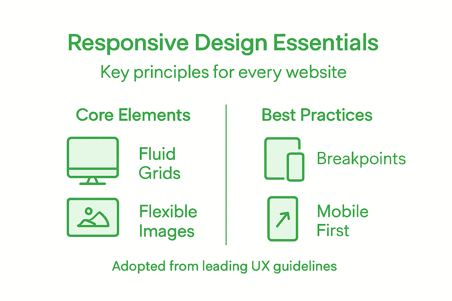
Every customer expects your website to feel seamless, whether they visit on a smartphone during a quick lunch break or on a desktop in a Luxembourg office. Responsive web design puts your business in the right place at the right time, adapting layouts for any device and delivering a consistent experience. By mastering principles like fluid grids, flexible images, and CSS media queries, you create a digital presence that drives engagement and ensures your site remains relevant in a fast-changing market.
Table of Contents
- Defining Responsive Web Design Principles
- How Responsive Layouts Enhance Accessibility
- Device Adaptation and Fluid Grid Techniques
- SEO, Conversion, and Business Impact
- Common Pitfalls When Implementing Responsiveness
Key Takeaways
| Point | Details |
|---|---|
| Responsive Design | Creating a single website that adapts seamlessly to any device enhances user experience and reduces maintenance efforts. |
| Accessibility Enhancement | Implementing responsive design automatically improves accessibility for users with disabilities, ensuring wider access to content. |
| SEO Benefits | Responsive websites rank higher in search results, increasing visibility and attracting more qualified traffic to your site. |
| Common Mistakes | Avoid predetermined breakpoints and ensure image optimization to prevent technical issues that can frustrate users. |
Defining Responsive Web Design Principles
Responsive web design is fundamentally about creating websites that work flawlessly across every device your Luxembourg audience uses. Whether your potential customers browse on their phones during lunch or on desktop computers at the office, your site adapts automatically.
What exactly is responsive design? It’s a web design approach where pages render well on all screen sizes and resolutions. The core idea: one website, infinite device compatibility. Instead of building separate versions for mobile and desktop, you build smart, flexible layouts that scale intelligently.
Three foundational pillars support every responsive website:
- Fluid grids that adjust proportionally based on screen width
- Flexible images that scale without losing quality or breaking layouts
- CSS media queries that apply different styles at specific breakpoints
These aren’t random ideas. They’re proven techniques that ensure consistent user experience across devices. When you implement them correctly, your site looks intentional on a 320-pixel smartphone screen and a 2560-pixel monitor.
Here’s how the core principles of responsive web design compare in terms of function and business impact:
| Principle | Main Function | Business Impact |
|---|---|---|
| Fluid Grids | Proportional layout adapts to screen sizes | Consistent look on all devices |
| Flexible Images | Graphics resize without breaking layouts | Faster loading, reduced data usage |
| CSS Media Queries | Apply styles based on device characteristics | One site supports current and new devices |
Your website’s success depends on meeting users where they are—literally, on whatever device they’re using right now.
For marketing managers in Luxembourg managing tight budgets, responsive design delivers remarkable value. You’re not paying developers to build and maintain three separate websites. One codebase, one maintenance effort, one source of truth.
Responsive design also impacts how search engines rank your content. Google prioritizes mobile-friendly sites in search results. Your potential customers find you faster. Your competitors who didn’t invest in responsive design lose visibility.
The flexibility extends to future devices too. New screen sizes arrive regularly. Responsive websites adapt to them automatically through thoughtful breakpoints and proportional scaling. Your site stays relevant without constant redesigns.
Pro tip: Test your website on actual devices used by your customers—not just browser simulators. Real-world network speeds and screen sizes reveal responsive design issues that emulators miss, helping you fix them before users encounter problems.
How Responsive Layouts Enhance Accessibility
Accessibility isn’t an afterthought in responsive web design. It’s built directly into the foundation. When your website adapts fluidly to different screen sizes, you’re simultaneously removing barriers that prevent people with disabilities from accessing your content.
Think about what happens on a poorly designed website. Users with vision impairments zoom in to read text. The layout breaks. They scroll horizontally, squinting and frustrated. Others using voice navigation software can’t interact with elements that aren’t properly sized. These problems vanish with responsive design.
Responsive layouts prevent common accessibility barriers:
- Eliminate horizontal scrolling that confuses screen reader users
- Ensure touch targets stay large enough for people with motor disabilities
- Keep text legible without forcing excessive zoom
- Maintain logical navigation flow across all screen sizes
- Support assistive technologies by preserving semantic HTML structure
Layouts that adapt to device constraints naturally support users with varying needs. A button that’s 44 pixels tall on mobile remains easily clickable for someone with tremors. Text that scales proportionally stays readable whether someone uses standard zoom or magnification software.
Accessibility and responsive design aren’t separate concerns—they’re interconnected. Better responsive design automatically means better accessibility for everyone.
For your Luxembourg business, this creates genuine competitive advantage. Users with disabilities represent significant market segments. They stay longer on accessible sites. They convert at comparable or higher rates. They recommend your business to others.
Responsive design also simplifies keyboard navigation. Clear breakpoints and properly structured content mean users navigating with only a keyboard can access everything. No hidden menus. No invisible buttons. No desktop-only features.
The cascading benefits extend to older adults, users on slow connections, and people in noisy environments relying on captions. Responsive design serves them all. One website. Universal access.
This table summarizes how responsive design methods enhance accessibility for different user groups:
| Method | Accessibility Benefit | Who It Helps |
|---|---|---|
| Scalable layouts | Minimizes horizontal scrolling | Screen reader users |
| Large touch targets | Easier interaction | Users with motor challenges |
| Semantic structure | Logical content order | Keyboard & assistive tech |
| Responsive text scaling | Improves readability | Users with low vision |
Pro tip: Run your responsive website through an accessibility audit tool and test with actual assistive technologies before launch. Automated testing catches 30% of accessibility issues; real-world testing with disabled users catches the rest.
Device Adaptation and Fluid Grid Techniques
Fluid grids are the backbone of responsive web design. Instead of using fixed pixel measurements, they rely on relative units like percentages. Your layout proportionally resizes based on screen width, so a sidebar that takes 25% of space remains proportional whether it’s viewed on a phone or desktop.

This approach eliminates the rigid layouts that break across devices. Fixed-width designs force users to zoom, scroll horizontally, or squint. Fluid grids adapt naturally, creating a seamless experience from 320 pixels to 2560 pixels.
How fluid grids work in practice:
- Container widths use percentages instead of fixed pixels
- Column sizes scale proportionally with viewport changes
- Padding and margins adjust using relative units like em or rem
- Typography sizes respond to available space through fluid calculations
Fluid grids coupled with flexible images and media queries allow websites to adapt fluidly to any device. Media queries act as breakpoints, triggering layout changes at specific screen widths. You might stack columns vertically on mobile but display them side-by-side on tablets.
Fluid grids aren’t just technical—they’re business-smart. One codebase adapts to every device your customers use, reducing development costs and maintenance headaches.
Device adaptation goes beyond simple scaling. Modern techniques include container queries that adjust elements based on parent container size, not just viewport width. This gives developers finer control over how components respond to their actual space.
Aspect-ratio controls ensure images and videos maintain proper proportions across devices. A video that’s 16:9 on desktop stays 16:9 on mobile, preventing distortion or awkward empty space.
For marketing managers in Luxembourg, this means your website works intelligently across everything your customers touch. A prospect browsing on their iPhone during commute sees optimized content. The same person at their desk on a large monitor sees enhanced layouts. No separate mobile site. No maintenance nightmare. Just one responsive system.
Breakpoints are critical decision points in fluid grid design. Rather than designing for specific devices, you identify where your layout breaks. Common breakpoints range from 480 pixels for small phones to 1200 pixels for desktops, with flexibility in between.
Pro tip: Test your fluid grids at actual breakpoints using browser developer tools. Resize the window pixel by pixel to find where your layout breaks naturally, then set breakpoints at those exact points rather than forcing predetermined device sizes.
SEO, Conversion, and Business Impact
Responsive web design isn’t just about making your site look good on phones. It directly impacts your bottom line through search rankings and sales. Google explicitly favors mobile-friendly, responsive websites in search results. If your competitors have responsive sites and you don’t, they rank higher than you do.
This ranking advantage translates directly to visibility. More visibility means more qualified traffic. More traffic means more conversion opportunities. The connection is clear and measurable.
How responsive design drives business results:
- Higher search engine rankings on Google and other platforms
- Reduced bounce rates when users find your site mobile-optimized
- Increased conversion rates as users navigate smoothly across devices
- Lower customer acquisition costs due to improved organic rankings
- Better customer retention through consistent, quality experiences
Responsive design delivers consistent user experience across devices, which directly improves engagement and conversion rates. Users who experience friction abandon your site. Users who experience smooth navigation complete purchases, sign up for newsletters, or request quotes.
A single responsive website beats multiple device-specific versions every time. One URL. One codebase. One analytics dashboard. Easier to manage, easier to measure, easier to optimize.
For marketing managers in Luxembourg managing tight budgets, responsive design offers exceptional ROI. You’re not building three separate websites. You’re maintaining one system. Development costs drop. Maintenance becomes predictable. Analytics become clearer.
Loading times and mobile navigation directly affect user retention and sales. A 2-second delay in page load increases bounce rates by 9%. On mobile, where users are impatient, responsive design that prioritizes speed becomes a revenue driver.
Customer retention improves too. Users who return to your site expecting the same smooth experience on every device feel valued. They trust your business more. They recommend you to others. Word-of-mouth referrals cost nothing but deliver high-quality leads.
The business case is undeniable. Your responsive website isn’t an expense. It’s an investment that generates measurable returns through improved search visibility, reduced bounce rates, and higher conversion rates. Every percentage point improvement in conversion rate directly impacts revenue.
Pro tip: Track your mobile conversion rate separately from desktop in your analytics. Identify which devices drive the most revenue, then optimize the responsive experience for those devices first to maximize immediate ROI.
Common Pitfalls When Implementing Responsiveness
Building a responsive website sounds straightforward until you actually try it. Many businesses launch responsive designs that technically work but create frustrating user experiences. Understanding common mistakes helps you avoid costly redesigns later.
One of the biggest mistakes is ignoring content-based breakpoints. Many developers rely only on predetermined device sizes like 768 pixels for tablets or 1024 pixels for desktops. But your actual content might break awkwardly at those points. Better approach: test where your layout naturally breaks, then set breakpoints there.
Image optimization deserves far more attention than it typically receives. Developers sometimes serve desktop-sized images to mobile phones, wasting bandwidth and slowing pages dramatically. Responsive images need multiple sizes and formats so each device downloads what it actually needs.
Critical mistakes to avoid:
- Forgetting to test tap target sizes on mobile devices
- Overlooking performance optimization for low-powered devices
- Neglecting CSS and JavaScript compatibility across browsers
- Failing to consider touch gestures and mobile input methods
- Ignoring loading performance as a core responsive design principle
Diverse device inputs like touch gestures and bandwidth limitations require careful consideration. A button that’s 16 pixels wide works on desktop with a mouse but becomes impossible to tap on mobile. Your responsive design must account for how people actually interact with different devices.
Testing across actual devices catches problems that emulators miss. That’s not optional. That’s essential.
Many projects underestimate the importance of maintaining visual hierarchy across all breakpoints. Shrinking everything proportionally doesn’t work. Important elements need more prominence on small screens where space is precious. Less important elements deserve less prominence.
Performance often gets sacrificed for visual pizzazz. Animations that look great on fast desktop connections create sluggish experiences on mobile networks. Your responsive website needs optimization for 4G speeds and lower.
For marketing managers hiring developers or agencies in Luxembourg, explicitly require responsive testing across real devices before launch. Ask for tap target sizes of at least 44 pixels. Verify that images are optimized per device. These requirements prevent expensive post-launch fixes.
Pro tip: Create a simple test checklist before launch: test on real phones and tablets from different manufacturers, verify loading time under 3 seconds on mobile networks, confirm all buttons and links are at least 44 pixels, and validate that your site works without JavaScript enabled.
Elevate Your User Engagement with Expert Responsive Web Design
If your business struggles with inconsistent user experiences across devices or high bounce rates due to slow loading on mobile phones, you are facing challenges that many Luxembourg companies encounter today. The article highlights core responsive web design principles like fluid grids and CSS media queries that not only enhance accessibility but also improve SEO rankings and conversion rates. At Done.lu, we specialize in crafting fully responsive websites tailored to your unique audience and industry needs. Our growth-driven design approach ensures your site performs seamlessly on every screen size, boosting engagement and customer loyalty.

Ready to transform your online presence with a website that adapts flawlessly and drives measurable results? Discover how Done.lu’s digital marketing and web development solutions can help your business stand out. Visit Done.lu to explore our portfolio showcasing over 150 successful projects. Learn more about our web design services and how we combine branding with inbound marketing strategies to generate leads effectively. Don’t let technical pitfalls hold your website back. Contact us today and start turning visitors into loyal customers with a responsive design engineered for success.
Frequently Asked Questions
What is responsive web design?
Responsive web design is an approach that ensures websites look and function well on all devices, from smartphones to desktop computers. It uses flexible layouts, fluid grids, and CSS media queries to adapt to different screen sizes.
How can responsive web design improve user experience?
Responsive web design improves user experience by providing a consistent and optimized layout across devices. Users can easily navigate, read, and interact with your site, regardless of the device they’re using.
What are the key principles of responsive web design?
The key principles of responsive web design include fluid grids that adjust based on screen size, flexible images that resize without losing quality, and CSS media queries that apply different styles at specified breakpoints.
How does responsive design affect SEO?
Responsive design positively impacts SEO by improving search engine rankings. Search engines, like Google, favor mobile-friendly sites, leading to higher visibility and increased traffic, ultimately resulting in more conversion opportunities.
Recommended
- Why Responsive Web Design Matters for E-Commerce
- “Responsive/mobile webdesign”: what does it mean?
- The Impact of User Experience (UX) on SEO: How to Enhance
- What is responsive design and what is its purpose? | Blog of Done
- Why Responsive Web Design Matters for Automotive Dealers
- Author Website Design That Converts: 5 Steps to More Newsletter Signups – The Digital Fair Blog | The Digital Fair


